Because of my interest in fashion portraiture, mainly to advertise aspects of make-up products rather than clothes I looked at the work of modern day make-up artist Karla Powell, a fashion, beauty and make-up artist based in London NYC. Her life is based around using her blog in her spare time whether this be Tumblr or Twitter to broadcast her work, she is head of Make Up Academy in NYC. She takes make-up to the next level and involved things such as sequins, various colour, over loading the product for a very dramatic and different effect.
The photographer is Jayesh Pankhania, in his work he particularly focuses on fashion portraiture and took these below photographs for Powell.


For my own photographs I decided to take inspiration from the sequin use, I didn't quite know what to do with them but they reminded me of a photograph of Lady Gaga by Kane Skennar a photographer focusing on fashion, celebrities and portraiture. Because of the sequins on her hood which I thought I could create a similar shape to the paint on her face but with these sequins. I used black and grey powders to create dramatic effects on the eyes and followed the straight brush marks on Powell's food make-up but with darker colours.
Because the Gaga photo was for Poker face Throughout my shoot I thought to use playing cards as a game element to the photograph which could also gives power to women because it tells the audience they can play this. Also incorprated a music disk to bring it into the idea of fashion involving someone from the music industry.
Here are my digital photographs, some looked better black and white and some both black and white and coloured. Photoshop used to edit them - brightness and contrast, highlights/shadows and selective colour alteration and colour balance. Advertises the make-up but also the top garment, underwear and music. Vinyl used it match the old scene I took these in, a run down, falling apart wall. But also a bathroom to represent partying) because this could be a party outfit) and an eventful rough night.


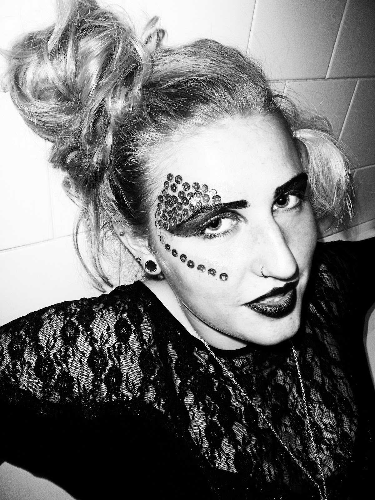


The rest below are my darkroom prints from an SLR film I took at the same shoot. Overall I prefer them in black and white because more contrast was achieved naturally.
Here is my contact sheet. F11, 15 seconds and full contrast.


Filter 5, F 16, 12 seconds.

Filter 5, F 16, 14 seconds.

Filter 5, F 16. 15 seconds.

Filter 5, F 16, 14 seconds. (Below photographs with disk are the same).


Below the out of focus effect worked with anger and the fierce grin she did, I achieved this by slightly turning my focus ring to blur the image.


Filter 5, F 16, timing 10.

Filter 5, F 16, timing 9.5.

No comments:
Post a Comment