Thursday 13 December 2012

Bec Wonders Inspired Work.

After analysing Wonders I decided to try out her mixed media technique on my own photographs.
Although I preferred her black and white prints with the paint on, I decided to see what it would look like on digital. I didn't like this result because I felt that the vibrant colours over whelmed the aim of the painting, the painting didn't stand out as something that the viewer is first drawn to but instead just looked out of place and like a mistake. I wanted to create an effect where the fashion in the photograph is still vibrant and on show but a meaning can be interpreted with the mouths being painted in detail, I also found it hard to paint in detail on the coloured photograph because of how bright the colours were, they were difficult to cover up effectively. I chose to use a blue colour because I thought it would contrast well with the orange and also because of how it looked on Wonder's work.
I kept to the blue colour on this one to see if I could create more of an effect with it by painting onto a black and white photograph instead, the detail cam tout much more and this one ended up vein guy favourite attempt. The framing of the face in the photograph was perfect to do this to because of how visible her mouth area is and it taking up a larger area because of the photograph being close up, unlike the previous photograph I tried to do this to.
I wanted to put my own twist onto the work by seeing if I could create a visibly just as effective look by painting in the Wonder's style somewhere else on my photographs. In this photograph I liked how visible the eye make-up was and how it is the first thing the viewer is drawn to, the contrast between the make-up and the pale skin tone could work effectively because fit would force me to use various tone soy the blue which I decided to continue using because of how pleased I was with its effec ton my last photograph. I liked this result and felt the tonal detail gave a real depth to the facial structure, but what I didn't like was how the fashion element of the make-up in the photographs as taken away by the paint covering it.
Finally I chose my second attempt as most successful and tried to recreate the effect on another photograph. I liked the shadowing under the chin here but felt that the tones of the face were slightly too shadowed which didn't allow me to contrast my tonal use of paint as much.

Combining Photographs in the Darkroom.

Bec Wonder's combining paint gave me an idea to combine photographs in themselves in the darkroom. I didn't think these would work too well but I wanted to see if they could lead me anywhere.
I took the photographic paper and covered up part of the paper that I wanted to expose a different photograph onto, I then exposed my first photograph at normal timing onto the paper that I wanted exposed, then I covered the part of the paper that had been exposed and revealed the part that was previously covered up, I exposed my second photograph onto this part of the paper.
I chose these two photographs because they worked well together run terms of the composition in the distance, the same distance meant that they matched up much better and gave an interesting effect, also relation to surrealism in the film itself.
This time the paper I used to cover up the parts of the photograph that I didn't want exposed at a certain time was ripped instead of cut, This gave a nice texture to the photograph because it looked like the background had been ripped on the face and revealed another surface beneath it. The background photograph worked well because it was slightly out of focus meaning the focus was kept on the face which I wanted to do anyway.
This one took a slightly more surreal approach and in my opinion didn't work as well because it looked too out of place rather than relating to the composition.

Tracing Paper on Photographs in the Darkroom.

I had previously wanted to see what my photographs in projects would look like with tracing paper on top of them with drawing relevant to their compositions on them, where the drawing was would be where the photograph didn't expose so I would get white lines in place on the print.
First of all I chose this photograph simply because I liked it and chose to draw around the basic shapes as a started to see what type of effect I would get and how well the thickness of the pen would work ect. I liked the outcome especially on the clothing, it added to the tone and put in a subtle contrast, the far eloped quite strange and scary which didn't work too well in my opinion, it looked too childish and simply drawn and didn't have the same effect on the contrast that the clothing had.
Here I avoided the face and chose to emphasis eon the lines of the straightness of her hair, I liked how it lightened the crown and balanced it out well with the tones of the rest of the photograph.
Here I printed pictures onto tracing paper to use them instead, I chose the queen of hearts playing card for relevance to my photographs, it worked quite well as an idea but was very hard to perfect, parts of the image didn't print onto the paper as well as others so parts of the detail in the illustration on the card were erased. They worked well coming in the side of this photograph because of the empty space by her side.I had to turn the F to 8 to allow the cards to expose and I did so for 4 seconds.
I also chose this photograph because of the empty space, the background tone was slightly darker than the tone the cards would produce, the cards looked very limited in tone and with a high contrast, this photograph printed in the opposing way, it was rather grey and dark rather than bright. I exposed the cards on F11 for 5 seconds.

I tried these experiments various times over and over to perfect but these were the closest I came, the other versions are seen in my book, I didn't take this further because of how unprofessional and childish it looked because of inaccuracy.

Zombie Tutorial on Photoshop.


Wednesday 12 December 2012

Sandwich Printing.

I had previously done sandwich printing inspired by Dan Mountford and liked it so I wanted to see what it would look like on these photographs as an additional darkroom experiment.
Timing of 19 seconds, filter 5 and F16. I chose this because I could present the surrealism with the size difference in the cups and my model. I liked the composition but felt it would work better with her on the other side of it and slightly less exposed.
Timing of 16 seconds, F16, filter 5.
I liked this one much better and felt the contrast and composition worked perfectly, she stood out the most and the cups were slightly faded but I liked it that way.
Timing of 18 secs, F16 and filter 5.
A final attempt, the same cup photograph but I chose my other model in a similar composition to the first to see how it worked, her hair being lighter took away the heaviness of the darker shade sin my previous photograph and I preferred it.

Idris Khan Analysis.

1978, English born artist based in London. He graduated from the University of Derby in 2004 and studied for an MA in 2004 at the Royal College of Art. Khan photographs things from a secondary resource and industrial subjects, this piece 'Every... Bernd and Hilla Becher Prison Type Gasholders', 2004, a photographic print, 208x160cm large. Although Khan has no official website his work has been exhibited in the Saatchi Gallery and he has his own biography on this page - http://www.saatchi-gallery.co.uk/artists/idris_khan.htm. We can see the industrial influence on his work here, part of a series the compositions are fairly similar with the building being the subject and in the centre of the space filling it and the blurriness giving it a sense of illusion, he aims to create a sense of depiction in motion, with variating opacity on the layers creating ghostly outlines which could link to the social culture of the prison by symbolising the evil and disturbed - what could be in there which is the hidden meaning which isn't immediately depicted. Although it is a realistic photograph in terms of scene, its presence has been exaggerated by the layers to draw us straight into it - making it the first thing we see. No action is visibly taking place but the website states that the various exposures and moving of the picture show time and age through the building by showing it moving slightly to the side or downward naturally.

The piece has been framed as a long shot of the whole subject rather than a close up of a selected part, a straight on simple angle. Shapes I can see are squares and rectangular shapes which are all very similar and created from the lines on the building, they create a linear pattern and contrast with the sky in the background, also the bumpy look to the grounds made of various grey shades giving it an eerie look. The balance in the tones works well because the various exposures all sit together, only the centre exposure stands out rather than the side ones which gives a sense of symmetry, the overall arrangement works well because it accurately relates to the meaning trying to be conveyed. 

The photograph has been planned posing isn't needed because people aren't present, the way of printing the photograph has also been planned because it is the process in the darkroom of the blurred development that carries all the meaning. The camera shows rather dramatic lighting, the subject isn't clearly lit but we can still see it, I assume it was taken either early dawn or at the beginning of it getting dark. 

This work first attracted me because of the darkroom technique which related to my blurring of the photographs, I also enjoy depicting meaning from photographs which can look so meaningless before you open your eyes to them and the possibilities. Although the subject matter doesn't link to my work because I am doing fashion the technique and process does, I haven't seen an artist/photographer do this before and I found it very interesting and helpful to link to my work, I realise that the blurring can have a very valuable meaning to it and my opinion is that it works effectively for this photograph but for my subject matter of fashion with outfits and portraiture it was a bit too deep and gloomy for my idea of Alice in Wonderland photographs, I thought that I could perhaps change the meaning to a distorted view on childhood characters because of the adult twist on them, but until then I plan to further experiment and see what is preferable to produce a final outcome with. I can imagine Khan's feelings when he took the photograph would be very focused and interested, planning to depict this meaning and having a knowledge on the building and subject to accurately produce this as he did.

Blurring Photographs In The Darkroom.

I saw work by photographer Idris Khan (who I plan to look further into if I enjoy this experiment) and he had blurred the photographs he had taken during exposure. I attempted this by choosing photographs and following their original timings, I halved it on the timer and exposed it normally like this. Then I expose fit again for the second half of the time but I moved the paper slightly up and too the side so that the same image was produced but slightly disorientated and jogged like Khan's work was.
This photograph worked particularly well because the subject matter was still seen just as well, the fashion aspect of the nail was too, it also gave a sense off that it was moving and that she could jog whilst purring the liquid. The tones on this photograph vary a lot and there isn't much empty and light space which helps because there isn't any light patches which look unclear because they have been under exposed by the half timings.
I liked doing this to a portrait because it made it quite creepy and alien like because of the four eyes, also the white background wasn't effected so it kept its professional look.
I did the same photograph again to see if it made a difference by making the blur slightly more far apart. I preferred my first attempt because it kept everything quite clear and in place still and I felt the lighter and slightly under exposed tones came out too much in this version.

I blurred this one very slightly and I thought it had the most effective texture because of the tones in the fur on the hood and the lines of the hair coming through so much. The contrast of the hat and coat compared to her light complexion was bought out well by the even more varying of tones by the intentional blur.
Her eI split the original timings 3 times to create 3 blurs, it worked very well with this photograph because of how clearly each blur was presented allover, there were no parts that needed more exposure because of the lessened time.
These experimentations lead me to solarise the blurred prints, it didn't work very well because the underexposed parts that were slightly lighter on the original print came out a very similar colour to the background which didn't give the blur a very good effect because it took away its look as a blur and instead just made the developing look uneven on the composition.
 I then solaris done of my photographs normally, I like dhow this photograph turned out but felt if I choose to take this further then I will need to burn the right side of the face slightly and the top of the crown.

Handmade Negatives on Photographs.

By using vaseline to stick salt and food colouring to transparent plastic, I created my own negatives (process previously explained on blog) and decided to put them onto of my own negatives for my Alice photographs.
F16, 7 seconds, filter 5.
I focused on creating an actual scene rather than something random, I avoided putting the salt ect. on the face because I still wanted its features to show through, because not much compositionally was going on towards the bottom of the photograph I thought that because of the underexposure on the areas covered in salt, the white space would look like snow with the salt particles presenting it falling. Here I accidentally got some on the face and felt that it ruined the effect, I also felt that the liquid creating the under exposed puddle look was slightly too much and took away the power of the original photograph.
F16, 9 seconds, filter 5.
I cleared the face of the salt and liquid and decided to just use salt for this one to give a more subtle and snowy effect which I was aiming for. I liked this one much more and felt that the scene I was trying to create was obvious too.
F16, 9 seconds, filter 5 and 1 second with filter off and F11 to solarise.
I tried to solarise the same composition, the exposure to the extra light was slightly uneven so it ruined the ffect it could have created, I didn't take it further because of it making the snow slightly less effective and clear to see.
F16, 10 seconds, filter 5.
I liked the contrast on this photograph, the 'snow' falling down gave it a very wintery effect, this was the cup shot where the nails were slightly less clearer than the other one and the handmade negative made it even more unclear so the only problem was that the fashion aspect had been taken away.
F16, 10 seconds, filter 5, 1 second on F6, filter 5 to solarise.
Because of the high contras tin this composition I tried to solarise again and to my surprise it worked much better than before, the silvery grey tones came out much better and the snow looked very clear and not too clumpy and over whelming like before.
F16, filter 5, 7 seconds.
This print had slightly too much salt on it and was underexposed but I liked how light it was in comparison to her hair which draws us straight to her face, the dress is slightly erased so I decided to add a few seconds onto the timings and do this again.
F16, filter 5, 10 seconds.
The clothing was shown much more clearly in this second attempt, the background was slightly too dark and the contrast between it and the snow was slightly too over bearing and took the attention away from the face and clothes which had became shadowed.

My second composition was my favourite out of all of these. I really liked my results for this experiment and will definitely consider coming back to it for a final outcome if nothing better is found by then.


Tuesday 11 December 2012

Backdrops In Photoshop.

Because of the backgrounds in my digital photographs were inappropriate, I decided to edit some in, I focused on the animated Disney film of Alice in Wonderland and chose appropriate backdrops from google. I would have created backdrops myself but rather than waste time if I didn't like the results, I experimented with these ones first.
I produced all of these on photoshop using the quick selection tool to delete the background and then pasting my chosen backdrop into a new layer. I made sure this layer at the bottom. I also used the quick selection tool to erase parts around the edge of my models that weren't needed from the original background. I also used the drop shadow tool to give some depth to the background making it seem more 3D and realistic rather than too flat.
This one worked very well, the pinks went well with the outfit and the depth of the dark reds and black looked professional by themselves and adding this backdrop gave it a more advanced effect and narrative combining the animation with the realistic photographs. The composition worked perfectly having her in the middle perfectly framed, the back drop wasn't too over bearing because it had less contrast and involved softer colours.
This one had quite an old fashioned vintage look to it because of the neutral browns on the backdrop, they went very well with the shading of the table and looked realistically like something you would see in a film (involving supernatural and surreal subjects) that would be the wallpaper or setting. The composition is very relaxed, the photograph works just as well as it originally did but this backdrop erases any signs or realism and take sue into a completely different and fantastical world.
This one had a slightly different twist to it, the background showed the actual animated characters, I felt this wasn't as effective because they were slightly overbearing, I really liked the composition and the fact the model is unaware that it is there, it makes it look like a thought, a fantasy or a dream.
This photograph worked well to show off the eye make-up, also the idea of dreaming in a fantasy world takes the fashion to a supernatural and magical level. The bright colours of their costumes contrast well with the dull background which I thought could represent night time/sleeping. It sits there subtly rather than overbearing and the drop shadow effect worked particularly well here because of how it blended in with the darkness and shadows already in the backdrop.
I liked the fact only Alice is aware of this shot being taken, and seen as this backdrop worked so well for the last photograph I decided to use it again for this composition, I felt it worked just as well but the last photograph was my favourite in terms of placement of the models in the composition.
This one was slightly more complex to produce because I used the backdrop of the queen of hearts as I produced the others, but also added more cards to be the flooring of this photograph so they looked as if they were standing up rather than floating, I had to right click, free transform and change the perspective of it to give realistic distance.I felt that the floor worked perfectly and was obviously appropriate subject matter, also composed very well, it wasn't overbearing and it was exactly as a floor would look on film, I felt that the queen in the background took over the contrast on the characters in the blues, blacks and reds, its contrast was also very strong and this mad fit stand out too much.
I did this the same way as the previous photograph and felt that the background here wasn't overbearing in comparison to the floor or models. All 3 costumes are clearly shown here, the backdrop editing makes this photograph perfect because the original background was what I didn't like about this photograph, the fact that the fantasy world shown by the costumes was spoilt by such normality.

I didn't change these for improvement or with my own backdrops because after experimenting with this idea various times, I realised the results didn't look 100% accurate in terms of the cutting out on the outside of the figures, it was also very time consuming and tedious, not something I would want to take further.

I chose all these specific photographs because I knew any of my Alice photograph would look good with a backdrop but felt in terms of composition these ones were most professional looking and accurately framed.

This work reminded me of Annie Leibovitz' Disney portraits, I have researched her in depth in previous projects and felt it unnecessary to do so again especially as I wasn't taking this any further.

Friday 7 December 2012

Alice in Wonderland Photographs.

I really liked the idea of my photographs of my friends dressed as fairies but seen as the film wasn't entirely successful I stuck to the same theme and idea but shot some more photographs of my friends dressed as Alice in Wonderland characters, also the idea of bringing the narrative of the film into the photographs would work better than my last shoot because I could use specific props and represent certain characters rather than just anything like the fairies which were quite unclear. I was inspired by my few previous photographs based on the mad hatter to produce more higher quality ones. 
Here are my film photographs.
This long shot effectively showed off the fashion but the lines on the ground and shaded background ruined it slightly, I would have erased them using photoshop but this photographs ssn't one of my favourites, the stance looked slightly forced and awkward rather than natural and effective because of lack of ideas on how to pose for the long shot but keeping within the frame.
A close up, this showed of the make-up and finer details more particularly on the hat and the fur of the hood, I had to burn the whit eon the collar slightly too.
Apart from the lines in the background I liked this photograph because of the relaxed pose, I could have zoomed out slightly to capture the whole hat and the knees completely in shot.
This photograph was slightly out of focus, I liked the idea of using the glass as a prop relating to the narrative of the tea party in the film, burning was needed again on the collar.
This photograph was also a favourite, The contrast worked very well because of the pale skin and hair and the darker clothing and reflection on the tea pot. It was quite a natural and relaxed shot, I captured the pouring red liquid which matched the clothes too.
Another attempt of the close up side shot without it being out of focus, dodging was needed towards the bottom on the right side of the photograph too.
Side shot again, the strong pose presented her status as a queen, the stare was quite harsh and pierces the viewer, the background looks distant and smoky too because of the tones.
Close up of the pouring liquid as a more subtle mood added to the photographs, low angle to see what looked best compared with...
This low angle shot which was successful because of the depth of field and the focus on the pots, her nails were perfectly done with red and black hearts which presents the fashion side to it more clearly than the photograph before.
Moving on from the Queen of Hearts I photographed another friend as Alice. The paintbrush worked well because it presents her in the film painting the flowers red, we were lucky to have some flowers props to present this with. Her glance looking down gave a more mysterious look and presented her dark make-up very well too.
The art on the clothing chest piece is shown well here, so is narrative and a relaxed pose, the drink ties in too, the hair is shown clearly too.
A close up showing the piercings and make-up clearly, also the twirls in her hair, distant glance showing her soft personality.
Longer shot sitting down, high angle makes her look slightly small which works well with the narrative where she is a surreal size to her surroundings. The contrast could have been increased in this photograph.
A favourite, dodging was needed on the left side, Alice name helps with identifying exactly who she is meant to be.
The slightly out of focus effect gives a vintage and more mysterious look to this photograph, she looks as if she is about to walk off, viewer wonder where, contrast is successful.
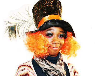
I photographed another friend as the mad hatter. this medium shot worked well because it effectively show her outfit, the trousers aren't as important as the abstract patterns on her cardigan and the make-up used, also the hat with the feather, the pot ties in with the narrative perfectly as this character hosts the tea party. Could have framed this slightly better to get the end of both sides of her cardigan in the composition.
Close up, the slightly low angle made it look like it was slightly out of place, although details of make-up are shown well, perhaps a portrait frame would have worked better.
A close up portrait, I wanted to get the full detail of the feather in it, her peering in gives this and also capture shed hair make-up ect.
Slightly out of focus but creates a strong texture on the hair and contrast between it and her face.
I moved onto digital photographs to see if the colour made them more effective or not. I like the colour in this photograph but feel that the background is a disappointment, a backdrop could have worked well, I thought that all my photographs I would take would have this problem, referring to my brief I thought that I could edit a backdrop in later to see how it brought out the photographs.
This composition was aligned perfectly and the glance matches the mood of the clothing too.
Contrast works very well, the medium shots work well too because they show us exactly where they are as well as the fashion aspect of their faces.
This photograph was very natural, they were all doing their own things but I asked Alice to look at the camera so that the attention is drawn to her although she is in the background, could be compared to a typical tea party scene and various aspects of their fashion can be picked out here.
This had a similar aim to the photograph before but this time framed as a portrait.
A contrast to an innocent children's film which works well for adult fashion, a drunken Alice, landscape to capture full body and create that image and shock.
The colours balanced really well in this photograph, the contrast between the black and white worked well and the powerful blue settles as a mid tone, the plain background gave it a more professional look. 
I decided to take some photographs outside, overall they didn't work too well, they looked very out of place and the background rather unprofessional because of the random props such as goal posts insight, the dull day didn't help either, it didn't match the happy and fun mood of the colour sin the photographs.
Still out of place but the bright colours were bought out more. 
We went back inside, I didn't focus on the backgrounds much because I knew I could edit them out, this composition was full of innocence and the colours and make-up worked perfectly for presenting the fashion aspect.
I used my painting as a backdrop, the colours were very varied and didn't match the outfit but I liked the artistic look and contrast between cartoon and reality.
The background was very invisible here and it worked much better and let her face stand out much more, the bright colours worked very effectively and I preferred it to the black and white photographs.
Another outside one, the windswept look didn't match my subject matter either.
Inside I thought it would give a more dreamy effect if they were asleep and perhaps look like stills from the film in a remake which I could use for the fashion aspect, composition worked well.
The background was very effective in making this photograph look professional and my experimenting with various angles paid off well because of the high angle used to present her power, the colours do this to because of the extremely high contrast.
The telling off works well in a long shot because it gives it purpose because it is showing off the clothing, their heights present this well.