Wednesday 14 December 2011

Light Painting with a Digital Camera.

Experimenting in the darkroom with a 14 mega pixel digital camera, maximum shutter speed 5 seconds so our drawings were done very quickly, we experimented with a normal torch, then laying the light with orange, yellow or purple tissue paper. We even tried using 2 torches at once to experiment with different colours, drawing circles, stars, random squiggles, letters and creating sillohettes by me drawing around a friend in front of me in the dark, whilst another friend operates the camera. here are the light drawings which I drew myself. Also shining lights onto my face and hands and moving them whilst turning the torch on and off to create eery dark effects.
Using a torch I drew as fast as I could in a zig zag motion around her silohette to create a ghostly appearance in the darkness, my friend stood infront of me the camera on a tripod infront of her whilst my other friend started the shutter speed when I started to draw. More light needed around her silohette for this one...
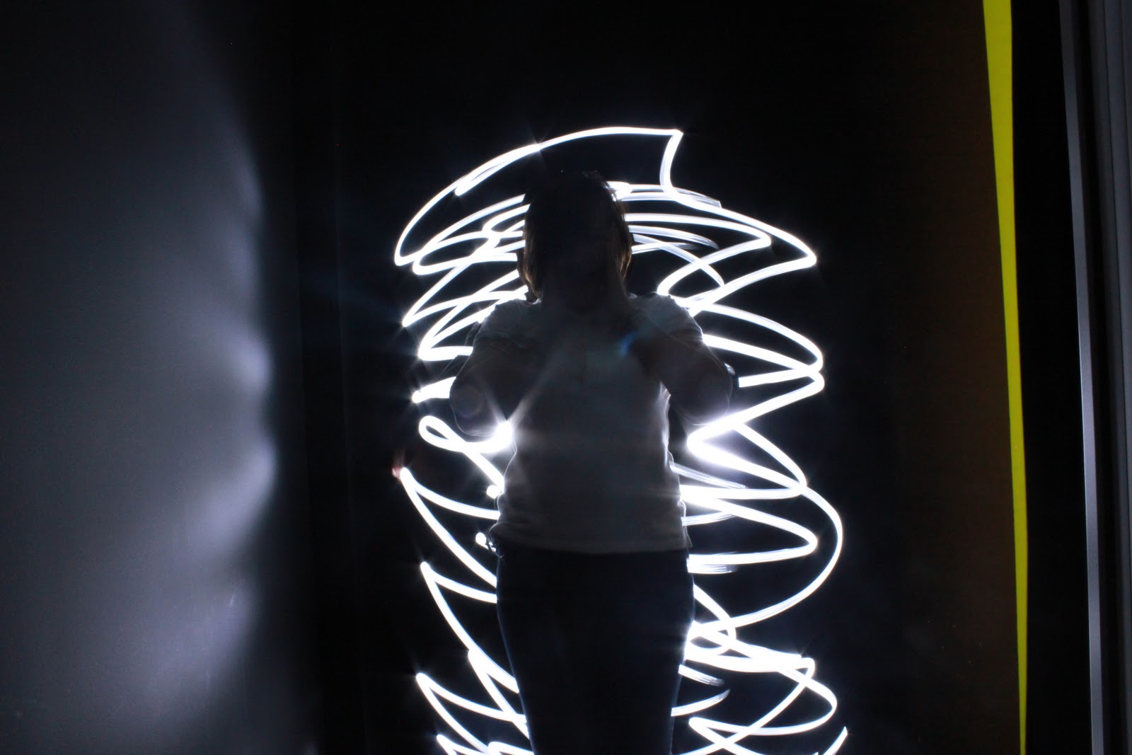
My second attempt at the same effect, more lines make it work better, the surfaces captured in the background add to the erriness of a figure like that being in a normal place, when cropped out the spacial effect was taken away (below).
 
Above are the same photographs although I edited the surfaces out using the clone tool on photoshop.
Using yellow tissure paper over the torch light this colour was created, the first one was random shapes but has a sort of cubist/surrealist effect in terms of the shapes created related to actual paintings by Picasso, the second a simple letter L for my name. 
Using two torches, we put tissue paper over them, one orange and one purple for a different coloured line created, my first try was random scribbles as shown above.
Same method as the last one, this time drawing stars with both of the torches. The second one worked best because my aim worked well.
This time swirls created, because they look symetrical almost I like their cold colours with the warm yellow.
Figures of 8 overlapping eachother with the same method as before.
This time I draw one star with the torches following the same path, shades of turqoise were created somehow with the purple here which I like. Although the shape didn't turn out well here so the one below is my second attempt.
Using the torch by itself below to create a circle, boring, too simple compared to my other ones.
Below the circle was more circular in my second attempt.
For my third attempt I tried to draw more circles around the same one but this didn't work too well and insted I ended up with lines.
Below my attempt to draw a basic flower created some very direct light flashes onto the lens (white light from the torch).
Below I aimed the torch at my hand rather than directly at the camera so that they would be captured and not the torch light, I turned the torch on for one hand, off as I moved my hand to another place and on again so that no paths were created during the movement, just the hands. The darkness around them makes its scary, their bluriness adds to movement of the picture and makes it seem as if someone is trapped or scared in a horror movie.
Below I did the same thing but with my face, I aimed the torch upwards towards it to capture it, then off and on again when I had changed position, the whole of the process of these photographs had to be done rather quickly because of the 5 second shutter speed.
Below I went back to the silohette idea I did earlier on and tried circular shapes instead and tried to really bring out the silohette more, the mood of these ones is much more positive rather than eerie. Light reflected on the wall also creates depth.
This one below worked really well because of the slight appearance of his face, the expression is positive adding to the excitement of the picture and wild lines around.
Below I covered the area where I would usually be drawing with the torch all around her with a curtain so that my drawing would only be seen on the left side, this added light to her clothing as if I was painting her with the light rather than just the background, her pose onto the certain was inspired by Patrcik Rochon's fashion shoots (Supernovae) involving various light painting of female models.
Same method below but I tried for a less blurry effect, it worked and I somehow got a beam of light firing across her face which worked well and look different to my others, my favourite one produced by me.
Below the light was brighter because we were just outside of the darkroon rather than inside like the rest, so I tried the silohette effect again with her features slightly on show, the light reflects off of the wall too looking almost like an explosion or landing of her.
Below I cropped out the right side showing the curtain and light so that the picture was fully focused of her and the light around.


A favourite below, 2 friends in an attacking pose, white light created by the torch, red created by a red laser pen to present his evil side towards attacking her, I chose this pose to relate to the horror theme of my earlier silohettes.

Thursday 8 December 2011

Light Doodle Website, Experimenting on the Macs With Light Resources.

These photographs were created in class as an experiment with the website Light Doodle, because of the extra light from around the class and through window gaps, it wasn't as effective on here as it would have been if I had used a laser pen/torch or anything with a light source to draw with. Using my mobile phone, CD's and even my own teeth I attempted to draw with the light because the website automatically adjusts the computers camera to only capture light and because of its extremely slow speed it aloows us to draw without our light marks disappearing. Slow capturing leaves the light shapes that are made and leaving the colours so I can draw what I like with light.
Created with the light reflection from a diamond ring and the light on my face, this reminds me of a sci-fi genre character, and although it is low quality like the rest of the photographs on here, I would like the effect if it was more clear, which is hard to obtain because of the drawing with the ring will involve my movement, resulting in bluriness of the face. Same colours of light created because of the diamonds single colour.
Created whilst my phones keys and screen back lights were still on, turning it around and moving it to fill up the spaces in the screen, various colours created, I quite liked this one.
Quite runnish in my opinion, attempted to write 'hello' with a ring, but I don't like how the background of the class is visible because of too much light, my hidden face adds mystery though.
No effect aimed for inparticular, random swirling and movement of my phone, light reflections created various colours and a sort of rollercoaster ride effect in the 'roads'.
First attempt at using the CD after seeing the multi-coloured effects my friends got, tried to gain just the shape but the turning of it resulting in a multi-coloured light reflecting path.
Bright light created from the random movement of CD's, my favourite part here is my white alienated eye in the bottom, looking creepy and unatural.
No light sources used, just the movement of my face capturing the movement and light off of my teeth.
CD used at a further distance, this photo shows nothing clear, but an interesting square patterned effect created from my friends phone I used.

Overall I didn't really liek using this because of the lack of skill and quality it involved and because of not having access to my own webcam I couldn't improve on this with new attempts of my own in a darker place.

Monday 28 November 2011

Chrystel Lebas Analysis, Panorama Photographs.

A fascination with darkness and the unseen haunts the work of London-based French photographer Chrystel Lebas (b. 1966). Using a panoramic camera with long exposure times ranging from two to six hours, Lebas creates sweeping, mesmerizing landscapes, which explore photography’s relationship with time and movement. Panoramic photography is a form of photography that uses special equipment and software that captures an elongated view of the subject too. as I can see in this photograph by Lebas it is horizontally very long and vertically rather thin. She took this approach with her photography and always focused on natural landscapes.
The photograph included in her work 'Etudes' French for 'Studies' shows a landscape of a lake as the main focus and trees also included. it was taken in 2009, it could have been taken from any time from the early 20th century to now because of technological advances involving panoramic cameras. This has clearly been taken on professional equipment because of the perfection in its development, supporting Lebas as an established photographer. it doesn't link with anything politically or worldwide happening, in fact it sits very well on its own, distanced from the normal world. It could link to history and time in a sense that it has been there forever, this is because everything included is natural, at this specific time (I am guessing early evening, after sunset) this landscape has looked like this for centuries. Because of the stillness of it I can tell a very fast shutter speed must have been used. Lebas's interest in darkness and unseen relates to this because of the element that as this time the dark is creeping in, but isn’t quite there yet, also the dark shadows on the water from the silhouette-like trees show a cover up of the unseen, what is under water? It is involved in the photograph but still hidden. Although Lebas didn't belong to an art movement, this photographs atmosphere would be suitable to for an artist such as Van Gogh to paint. This photograph was not taken for any particular purpose, it was taken as Lebas's personal approach and style to photography.

I think that Lebas chose to work from this sources because of the composition, the lake is what is seen first and takes up the majority of space in the picture, but so it isn’t too plain the trees that pear in on the side work perfectly well to fill up the space, and both these natural elements fit together because of their contrast and differences. The lake focuses on tones and pattern because of the ripples and reflection a more surreal view of the landscape above is shown, whereas the trees are solid black silhouettes looking smooth is texture because of the dark lines. because of their bold statement and the water with very few ripples, no movement is created in this photo. the photo could feel like an illusion because of this, as if it is too quiet and still to be real, something should happen but it doesn't, silence is just left there.

The untitled photo helps to suggest more mystery, perhaps the atmosphere looking in the middle of nowhere helps us to relate no title to it. The theme is definitely time and space, which was Lebas's aim, the space is still and so is time it seems. I don't think there is a particular story here but perhaps just a sense of a story of nothing, just a still landscape that has been there forever, nature being a narrator. Because of the nature being important we don’t think of people or any living specie being involved, there isn't even a sign of any birds, meaning Lebas's attempt to present time seems even more powerful because time seeming paused is supported by no movement even to creatures in the sky, hey are non-existent in this photograph.

My first reaction to the work is that I like it because of the contrast in the cold looking blues and whites on the water surface to the sharp blackness of the trees, i am drawn to the lake first but see the trees almost as stencils even though they are real. The sense of silence is felt and also coldness due to the lack of sunny colours, it must have been winter when this was taken. It reminds me of a photograph I once took on a digital camera of a lake with trees reflected in it, although this was late evening in spring (shown below).
This photograph was taken with my 14 mega pixel camera in my garden (around 4.30, winter evening) and although no reflection of water isn't related, the colours reminded me of the sky in Lebas' photograph, and the almost unreal lines created from the trees.
The same place in my garden but at a different time of day (around 6 on a winter evening), different to Lebas' but I wanted to see what different amount of light/different coloured sky would turn out as a photograph.

Pablo Picasso Analysis, 'Light Drawing'.

Life photographer Gjon Mili visited Picasso in 1949. Mili showed the artist some of his photographs of ice skaters with tiny lights affixed to their skates jumping in the dark–and Picasso’s mind began to race. The series of photographs–Picasso’s light drawings–were made with a small flashlight in a dark room; the images vanished almost as soon as they were created. So this shows 2 peoples art work, Picasso's drawing with the pen and Mili's as a photographer, a slow shuter speed must have been used to capture the image very slowly as Picasso drew it as quickly as he could. Although the overlapping of Picasso himsel fin various positions doing the drawing suggests it took him longer to draw it and Mili captured it all in 3 different photographs and then overlapped them in the negative carrier when developing them. The photograph is also completly in focus so a small aperture must have also been used. it links to other forms of art seen as Picasso belonged to the abstract art movement, his drawing here works well with his other works such as the 'Weeping Woman' because of the shapes he has created, we can tell this is a man but it is abstract because of the distorted and out of scale shapes he has created with the pen, as if the man is warped and floppy. I think the circumstances and focus of Picasso's previous work has influenced him with the way he drew this man. He decided to create this from his own imagination, not as something for anyone else e.g a magazine.

Drawing and accuracy skills were needed when Picasso did this, also speed, speed also apllied for Mili as he would have to set up the camera in time for each image to be taken. I think Picasso chose to work from just this pen because it shows something different to his painting and also the light in a darkroom works well to produce a man made from lines, instead of a 2D approach like his line drawings, it is much more practical and 3D which is a change for him. Shape and line are the most important elements of this because it is a line drawing itself and the shape of it will determine what people think it is and how it looks overall. The composition works well because it shows Picasso in action on his own work and the work itself, it creates movement because of the coice to overlap him at different stages, it shows his drawing process and how he did it along with Mili's constant focus on him and his ability to keep the camera in the exact same spot. It also shows the scale of the actual drawing - larger than Picasso himself. The background being kept simple also helps us to focus on the main elements of the photograph - Picasso and the drawing. The illusion is that something odd and strange looking (the mans shape) is in the normal world of normal men.
 
As a genre i would associate this with art, movements such as surrealism and abstract because. I think Picasso is trying to show the practical side of his art, also his capability to do it under pressure (the camera time). I think he is exploring something new and visually showing normal things with the light rather than trying to symbolise something. 
 
When I first saw it I didn't notice the photography skills side to it because I was drawn straight to the light which is the most important part of the process visually, but could not have been captured without a technically advanced photographer. It doesn't remind me of anything I've seen before, it is new to me and I find it quite fascinating. it inspired me to try it out for myself. I like it because it looks like fun to do but also very complicated and different. If there is a narrative to it it is definately the process, this is recorded by Mili and done by Picasso, it shows different stages of the production of the man in one photograph.

Still Life Photographs.

In class we took photographs using our SLR cameras, we set up small scenes of various objects and use an angle poise lamp to create shines reflecting off of these objects, such as light bulbs (relating to light themselves), metal wire, glasses, a bicycle wheel, mirrors, taps and a wine bottle (using black and white film). Our photographs came out sucessfully on the negatives. First of all I did a contact sheet of some of my developed negatives. The scratches on this print are from glass placed over the top of the negatives to stop them bending and arching so I could avoid bluriness and undefined shadows on the print.
I then did a test strip of each of my photographs. For them all I had my contrast on 5 (the highest) with the filter on, and my light of 11 because it was on this number for my first test strip and worked well I decided to stick to it.
The timing worked best on 3 or 4 seconds (darker side being the part of the photograph exposed first so exposed the longest, each different shade adding on a second from light to dark) I decided to produce a print of exposure time 3 seconds and then 4 to see if the lighter or darker result worked better.
Above is the print exposed for 3 seconds, I like it and think that it turned out perfectly, the contrast darkens the metal cup and lightens the background making it look more effective and natural. The focus in this photograph was correct on the SLR and I didn't try anything fancy with it, every object appears clear and focused.
Above is my 4 second exposure print, it creates more of shadow from the light when it is darker, but I preferred the 3 second one because this one looked a bit too gloomy and over-exposed.
The test strip above worked best at an exposure of 3 seconds so below is the print created like this.
This photograph is possibly my favourite one of still life I have taken, instead of everything being in focus I focused on only the tap handle, it shows light reflecting and I am drawn straight to it because of the unclear and blurry background being blurred out of my attention effectively for the photograph. I can see a slight watermark on the right side of the print, I later noticed it on the negative as dried water rather than an error of my own.
This test strip worked ebst at an exposure of 3 seconds it seemed...
After I did this I thought it looked a bit too dark so looking back at my test strip and realising the part of the photograph exposed for 3 seconds was the lightest part, the wine bottle being darker looked over-exposed at this time though because of its darker shade, although 2 seconds was too light so below is my print of the same photograph exposed for 2.5 seconds.
Test strip above shows 3 seconds as the best exposure time.
I like this print particularly because of the shadows created and the clear reflections from the teapot, also the lighter parts of the objects glistening with light reflecting off them, also the slight appearance of the lamp itself in the left top corner.
For this photograph I didn't do a test strip because I felt that 3 seconds worked well for all the rest, although I think it is successful it is brighter than the other, showing a more natural light from the windows of the classroom coming through.
This above photograph turned out well although it is slightly pixelated because I decided to experiment with the photo in photoshop to see what I could do by altering the contrast and brightness on the screen as well as adding it on the enlarger. The shadows were brought out more and I liked the effect it created although I preferred the natural light looking look in my other photographs, exposure time was also 3 seconds.

The test strip above is blurred/jolted because of my accidental movement of it when moving the black paper along whilst it was gradually being exposed, although I can still tell that 3 seconds is again the best exposure time.
I played around with the focus ring again in this photograph, I focused on the lightbulb in the cup, although it reminded me more of a snow globe when photographed. The blurred background works effectively in contrast to the perfectly focused bulb because it is different and more interesting, I think particularly clear focus on on large part of a photograph works well with close up shots on single objects.

The above test strip works well at either 3 or 4 seconds it seems, so I tried out 3, 3.5 and 4 to see what shade of darkness and light works best.
3 second exposure (above) looks natural because of more window light coming through, I am pleased with the outcome of it.

3.5 is my favourite, resides between the lighter and darker outcome, and uses the contrast well because of this, also stays looking natural rather than edited.
4 seconds was slightly too dark, looks over exposed and not as effective and clear as the 3 or 3.5 seconds, no relections and looks as if a flash would need to be added, which we didn't use for these photographs.

Best exposure time for the test strip above was 2.5, 3 looked too dark and 2 too light.
This photograph was rather different to the others, instead of focusing on a particular close up object, I focused on the cup and taps in the background, leaving the wine bottle out of focus although it is much darker than the rest of the picture and we are drawn to it first, I preferred the close up focused photographs although this was something different for me to try out.
Here is tried to focus on something in a midshot rather than close up or too in the background, I think it works well in a simular way to the close up, the background is still clear because of the accurate 3 second exposure which I successfully guessed for this photograph rather than testing. The light difference on the different angles of the wall captured in the backgound works well too.
This photograph was taken using a digital SLR, focus slightly differed from the bulb and jar accidently, but I still liked it, I liked the colours of the paint splashes showing as actual colours rather than contrasting shades in the SLR photographs.
Another DSLR photograph, shows shadows well and bicycle wheel is quite a random object to put with the jar although the bulbs could relate to thinking and jar to creativity, shadows created work well.
Same DSLR photograph but this time edited on photoshop to black and white, and contrast and brightness adjusted to its most effective appearance.
Again edited on photoshop in the same way, I like the blacks contrasting with the whiter shades here.
Although the DSLR looks clearer and more modern, I think the naturally created light and contrast on the SLR photographs works better, the vintage style of the prints works well in relation to the old and maybe mis-used and abandoned objects. The black and white also works better because I like the shades created from the light.

*No photoshop or computer editing on these photographs unless stated*