Tuesday 30 April 2013

Cyanotypes.

A cyanotype is a cyan-blue photographic print (hence the name). It was popular in the 20th century because of its low cost because of how simple they are to produce. They are created by a solution of two chemicals - potassium ferricyanide and ammonium iron (3) citrate. This solution is painted/spread across a surface which you wish to print the photograph onto. This is usually paper of any sort and any colour, although a lighter colour works best because the deep blue colour of the print will stand out better. Whatever you wish to print in placed on the paper once the chemical coating is dry (it is important to keep the chemicals in the dark once they are being spread onto and dying onto the paper or even fabric which can also be used, this is so it isn't exposed to light). If the print is a photograph then an inverted print is placed onto the dry chemical layer on the material when it is put in the sun. Cyanotypes needs bright sunlight to develop, artificial UV lights can also be used. The exposure time can vary, the brighter the days the less exposure time (6-8 mins) and the less bright the longer (judged on how little light there is, although too little could result in unsuccessful results). You can also achieve a photogram effect by placing objects onto the paper when exposing. Whatever parts of the chemical layer that are hidden from the light will result in being white, parts that are exposed will achieve a tone of blue. 

Cyanotypes can also be printed onto materials like glass and plastic but a special solution is needed to coat these materials before the cyanotype coating is layered on, this solution is ver complex and not available as a resource in college.

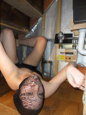
 I started by printing on basic white paper. I used photoshop to open my image from the shoot that I wanted to use (the face close up because it blocks out the metres and captures the shading on her body and texture of the tights on her face). I used the black and white photograph because it is monotoned like the cyanotype will be and like the inversion of colours needs to be and this can't be achieved by using the coloured or solarised versions of the photographs. I clicked on the image tab, then adjustments and then invert (below).
This inverted the colours of my image, the black became white and vice versa. This is necessary because the white spaces will be where the sunlight travels through to expose my cyanotype and the black will not be exposed which will give me my image as a blue print with the dark and light tones the right way around. I then made the contrast higher on my inverted print so that the will end up completely whit eon the cyanotype because the contrast will make it darker allowing less light to come through. The contrast won't make the white any brighter but the sunlight can travel straight through the white anyway.
My image now looked like this.
I printed this onto tracing paper so the light can travel straight through the white parts easier than white paper.
I layered this onto my chemical covered paper and left it to expose in the bright sunlight for 7 minutes (the approx. timing for a very bright day).
The last step is when taking it inside to cover it up so no light over exposes it, and in complete darkness (in my case the darkroom) rinse it with water until blue starts appearing. It is then left to hang in the dark to completely dry.
Here was my result, the blue printed perfectly, the one thing I would change about this would be the edges, I didn't coat the paper enough so I can see faded parts where there hasn't been enough of the solution to develop the edges of the photograph. The tone on the legs and underarms looks great and very realistic.

I followed the exact same steps and produced another print (same photo shoot and same timing on the same day of the bright sunshine).
Here is my result, once again more of the chemical is needed around the edges to create the full effect but here it looks like is gradually fades which actually works quite well, it gives a subtle effect to it rather than looking completely wrong.

I then decided to create a print using larger paper and lying on it, this relates to my theme because it will create an impression of an unidentified silouette trying to push out of the darkness (the blue) if successful. The lack of identity will also add to the mystery of the shape. I used 2 A1 sheets of paper to completely cover my body. I lay out in the garden and exposed myself on the paper for 10 minutes because the sunshine was less bright than the other day when I produced my first prints.
Here is my result, it worked and my figure is seen but parts of the blue are slightly faded because they have been washed for too long, I like the hair because light and dark tones are created . Large edges of the paper weren't covered in the solution so the edges has a rather jagged look to them. This reminded me of swimming or somebody drowning in the water because of the rippled look of the blue tones where they vary and the blur or lack of identity of a human face when underwater.

I really enjoyed creating these cyanotypes and I hope to produce another more successful print of myself to use as part of a final piece in my exam because I feel that it could work very well when totally successful.

Wednesday 17 April 2013

Experimenting With My GIF.

I began experimenting with changing the colours, I started off with a simple black and white toning. I had to use photoshop and open each photograph involved in the original coloured gif I created from the shoot and put them into black and white. I increased the contrast by 300 and brightness by 170 to achieve a very bold black and white rather than a dull and flat look like this which was how each photograph looked here and it didn't emphasise the white brightness of the white on her limbs which let her shape stand out which is needed for the movements to be clear to present the movements.
I saved each photograph with its new effective contrast and clicked on the window tab in photoshop and selected animation, I also went onto files, then scripts, then load files into stacks and selected these photographs. When the order is important (which it is for these photographs because the movements need to be in sync) I ordered them by numbering then 1-16 in their name so I could have each photograph in the right order when they appear as a layer in the layers box. I followed the same steps I have when creating all of my gifs I have made before which I have always found easy and simple, it also doesn't take long at all.
I kept the speed at 0.2 like before because it kept the panic there and also drew attention away from the background moving because of inaccurate framing when captured on camera. I saved the gif by saving to web and devices on the file drop down menu with a width of 300 which is enough to keep pretty much any picture from a digital camera sizing in place.
Here I kept the same file/gif open as before after I had saved it and simply changed the speed of all of the photographs to 0.4 to slow it down a bit. I felt the panic mood was gone by doing this but instead a possessed mental feeling was created because the slower speed allows us to see her smile at the end which looks evil rather than scared, this makes us scared rather than sympathising and feeling scared for her as an audience. If I create more gifs and have this speed/effect I would make sure the framing is perfect because it shows up much more here which ruins its realism of movement. Also saved with a width of 300 and to web and devices. 
Here I put the speed back to 0.2 using the same file opened but selected a few of the photographs in the animation slides to give a more synchronised effect because the first 10 photographs were captured at the shoot as purposely being in sync, but the other photographs were randomly taken and I fitted them into the gif by placing them where I thought would be accurate but by erasing them my gif looked much more in sync and showed a narrative of her uncurling from the corner and gradually moving closer towards us which creates a mood of tension. (All gifs saved to web and devices and a width of 300).

I now decided to see what my gifs would look like solarised.
Here I separately opened all of the black and white photographs used in the gif on photoshop. I solarised them by following these simple steps - 
- I clicked on the layers tab at the top and scrolled over new adjustment layer and clicked curves.
- Making sure the output and input in the box that appears is set to zero, I clicked on the little pencil icon next to it down the side, I drew an inverted V that should look something like this.
- I then went to layer, new adjustment layer and clicked curves again to create a second curves layer. This time I clicked on the editing points of moving the curves tool (above the pencil) and dragged the curve out of shape to look like this.
- This gave me this result, a solarised digital image.
- I did this to each of the images, because the lighting and contrast in them has already been edited and looks near enough the same, these curve adjusting steps will create similar shades of silver and grey in each photograph so that the tones don't randomly change whilst the gif is playing and look out of place.
Here I used all of the images rather than just the synced ones and had it on a speed of 0.4 seconds each slide for slow and scary effect.
Here I kept the speed the same but just used the photographs that were in sync which shortens the time of the gif and looks better (I know this from experimenting with this on the black and white gif. 
I feel that the solarising works really well because it lets her limbs stand out like the black and white one did but has a darker tone which relates to the dark theme, the silver colours look alien like which adds to the unusual style/theme of these photographs and makes her look inhuman. I will definitely experiment with solarising a gif with my future subject matter because of my success. To improve this particular gif I could erase the background because the silver/grey makes the meters stand out more. As successful as these gifs were I didn't enjoy making them because of the repetitive steps that are taken, although I felt it was worth it.
I opened each solarised file into photoshop separately and I used the eraser on a thick solid brush and an opacity of 100 to completely erase the backgrounds in the photographs leaving me with just her figure in complete darkness which make sit look more scary and doesn't give the viewer any distractions from her because she is the focus and all that is in the composition. It could be improved by the erasing being done more carefully so that the arms don't look odd and bumpy (too much flesh erased). This is a speed of 0.2 for panic but I thought that by making it faster (0.1, below) we could be distracted from the slightly wonky erasing because we will have less time to focus on it.
This solarised result was definitely worth creating because the darkness works much better than meters.

Tuesday 16 April 2013

Lucy Dobinson Inspired GIF.

Using exactly the same method on photoshop (CS5)that I did for my candle and blue drink gifs, I created this with my Dobinson inspired digital photographs.The set the speed at 0.2 seconds per photograph because I felt that the fast movements helped create that panic feeling of being trapped somewhere. Her getting closer to the screen also bringss the viewer inside and creates a whole narrative of wether she is coming to get them. Her spider like movements remind me of a horror movie where somebody is possessed and becomes extremely flexible. I could have used the cropping technique/tool to create a more accurate result with the framing to keep the background in place but this would be very time consuming and I don't think these photographs have enough potential because of the lack of composition because of the elements in the background. This experiment has helped me to see that making a gif with these sort of photographs will be successful but they will definitely need reshooting. Because my model isn't available for the next week I decided to experiment with making gifs with these photographs in the mean time, this would still give me an outline of what would work with my other photographs.

Lucy Dobinson Inspired Digital Photographs.

I also took some digital shots at the third film shoot. Although the composition isn't great because of the electric metres being in the background althought I knew I could edit them out using photoshop. These photographs show the colours rather than being black and white, also I could flick through them on the camera once I had taken them to see how the movements looked and that they could work as a gif like Dobinson did by being in sync with eachother.


Monday 15 April 2013

Film 3 Photographs.

These photographs weren't successful. I thought that the camera would stay in focus seen as each shot was being taken from the exact same place but it didn't fully. The shutter speed was on 1000 so each shot was captured quickly but not quickly enough, 2000 will be needed. Also, the framing wasn't accurate despite using a tripod, when the film was being wound the camera moved slightly. The lighting was too bright and resulted in her skin being much too white and looking other exposed even when burning in the dark room.  This shoot will need reshooting.
All prints exposed on a filter of 5, lighting f16 and timing of 20 seconds (burning when stated).


15 seconds burning on right side.


15 second burning on right side and face.
Dodging on the head.

Wednesday 3 April 2013

Film 3 Contact Sheet.

Filter 6, f16, 14 seconds. When developing this silm strip, something went wrong on part of it (where the white gap/un-exposed mark can be seen on the left). I suspect accidental exposure to light on this part. I can tell that the photographs will all need a similar exposure time when printing.

Film 3 Shooting Plan.