Friday 28 September 2012

Photoshop Vignetting.

Vignetting on photoshop
I started off with photographs taken of a friend as the mad hatter (below), inspired following Leibovitz's Disney 'Dream' Portraits.
Quite dark around the edges anyway and they aren't needed so I thought this composition was appropriate.
The vignetting is very simple -
1. Go to the filter tab and then lens correction.
2. Click the custom tab at the top of the window that pops up.
3. Drag the meter that is called vignette up for a lighter outside, and downwards for a darker look. This was more appropriate for my darker image.
With my vignetted image I adjusted the exposure because her face looked quite dull, clicked image, adjustments, exposure and I slid the gamma meter up. This gave it this flash in the dark effect which was quite spooky and effective with her facial expression.
Second image I decided to edit.
Allows us to focus on just her face and appearance, she also looks 'caught' or in spotlight.
Brightened the face by adjusting the brightness and contrast (image, adjustments, brightness and contrast), also the brightness and shadow option to incease the shadow made, and finally in this menu the highlights were brightened/bought up for the colour to stand out more.

Solarisation.

Solarising in Photoshop
Solarisation is a phenomenon in photography, it is when a print is partially reversed in tone, for example lighter parts become dark, although this change in tone isn't as dramatic as the actual negative, instead it gives various shades of greys within the print. I've explain below how to achieve this effect in photoshop and practically in the darkroom.
Man Ray (born 1890) was an American modernist, his works included various media such as photograms which he referred to as 'Rayograph' int reference to himself, illustration, fashion and portrait photography (often avant grade style) and solarisation. This inspire due to try out this technique for myself.
 These hands that Ray solarised reminded me of a negative, I think that the exposure time under the light after developer wasn't long at all because ether are lighter than my own attempts.
These lilies didn't look solarised to me, I think that he used the effect minimally here with a very short exposure under light time and not letting th image come throughout much at all rather than letting it have a very contrasted and dark solarisation by exposing the developing print under the light for a full second. 
Above is my print that I previously scanned in, I used this as my first attempt. whatever photograph you use, you have to make sure it is black and white or convert it to black and white before you start the editing.
1. I clicked the layer tab, new adjustment layer, curves and then click ok.
2. Clicking the pencil icon, starting from the bottom left hand corner where the input and output shown below is 0, I drew an inverted V as straight as I could (below).
3. I clicked on the freeform selection tool to bring up small boxes you can see on my drawn curve below, this allowed me to move them around in any direction until I was happy with the solarised effect my photograph was given.
My first attempt, it turned out exactly how solarisation is meant to look and what I've seen from the darkroom, I think that I will prefer using the darkroom because although the tones are perfect there, the shapes are slightly outlined where their edges are and it gives it quite a sharp and unnatural looking effect because it makes it too patchy which doesn't look as professional and flawless.
I experimented which adjust the brightness and contrast, although this still looked solarised in the background, the whites of the face started to appear, ruining the idea of solarisation being a reversed effect or looking like a negative, the face should have been dark to do this and I preferred my first attempt without the extra editing. Her face here reminded me of an x-ray, the shining through of the bone structure, leaving her sockets where the bones wouldn't be which I thought was quite interesting because of the ghostly and super natural appearance.
With my press print here which is shown earlier in my blog, I wouldn't be able to solarise in the darkroom because it would all develop  rather than leave the shattered shapes so I decided to try it out in photoshop to see what effect I would get. I like the dark background and the x-ray effect on the hair, the face looks quite normal and isn't exactly solarised because the colour hasn't reversed properly because of how light the tones originally were but I still liked how it was like a reflection, droplets were on it which I thought could represent somebody's shattered reflection, or even something ghostly if you see it as looking back at you from the glass with a drowning rippled effect.

Solarising in the Darkroom
Before I started I made sure that another enlarger in the room was set to a second in timing, full contrast and extremely bright lighting of 5 ready to use for later in the processing.
1. To do this I exposed my paper for the appropriate time/contrast/lighting as usual.
2. After that I put it in the developer but the important part is too take it out as soon as you see your image coming through on the paper before it has fully appeared.
3. Quickly I took it to the enlarger that was set for a second and exposed it under this high lighting for that amount of time. The timing for different negatives can vary on this exposure but usually is a second and trial and error will decide if this is too long or not long enough depending on the empty white spaces on the negative which usually come out much darker and can look over exposed.
4. I then took it back to the developer and left it there as normal until it had the right tones and contrast that I wanted (showing that it had developed enough) and had the solarised effect on it.
5. Finally, place the print in the stop for 2 minutes and the fix for 5 minutes like every print we make, before rinsing it and leaving it to dry or using the drying machine.
I wanted to try and solarise this composition because of how contrasting the tones were considering light and dark space. I hadn't developed it before so following my test strip and results of other photographs I had taken from this setting I though that 18 seconds on a full contrast with light 16 would be the right choice, to me the above looked too light meaning underexposed and as if it was fading, also lacking contrast, so I decided to up the time to 24.
Above is my result on 24 seconds which was perfect in terms of contrast, exposure and the limited developing time I had given it.
Here is the solarisation, for a first attempt I thought that it came out perfectly, the lighter greys really showed the shape and line detail in the photograph, it also made the day time sky look light night. I think that the texture of the bench and trees, even the grass has been highlighted particularly well here, I can see the line son the bench which look as if they would feel bumpy, and the fluffiness of the trees because of the tonal changes in their shadowed parts and sunlit parts. I can see each strand of grass individually because of the light originally shown on it has been reversed to darkness allowing the shape of the strands to stand out and look very 3 dimensional rather than flat. it is odd how an unnatural effect on a photograph can make it seem more realistic and easier to imagine that you're actually there. Also, I can see where the sun is coming from and this works effectively because it is shining straight onto my subject/model from the outside of the photograph, peering in naturally which is the best light to use when photographing in natural light.
Knowing the timings for this negative I followed the procedure, when it was completed I though it looked slightly too dark and I could gain more contrast in it so I reduced the after developer exposing enlarger to 0.5 seconds instead to lessen the light that will hit it.
Here is my 0.5 second result, the lighter greys came out lighter which I preferred it, it looked correct rather than slightly over exposed. I thought that the detail and magical look of the leaves was taken away here, it is more about shape and is quite blocked rather than showing each little part of it which the original did - for example tones and lines within each of the original shapes allowing the light to make an effective impact.
Here I put the enlargers time back up to a second. The result I got here was very effective because the dark shape on her face was created by the smoke she was blowing out of her mouth, it was like it symbolised how smoking can destroy your inside or be unhealthy because it has defaced her in this composition. The over exposure on the chest also marks where the lungs and breathing system are which are the parts of the body mostly effected. I also like the the bench marks are very visible here like the long shot of her sitting on the bench but more close up and easier to pick out, the shadows looks blended whilst the lines have an opposite effect and sharply stand out, presenting harsh surroundings.
This one didn't work properly, I think that there was too much white space which was easily over exposed, I also saw what it would look like if it wasn't exposed whilst I was developing it but it was too late to keep it that way, also it didn't look great because the contrast wasn't very clear at all. I coudl also see marks which had some how been mad eon the negative on the side of her face which made it looks quite uneven in tone and produced quite messily.
Finally this one was one of my favourites because the smoke caused a similar effect on her face but this times looked less exposed and worked more effectively because of the tones slowly becoming darker and blending into her face, showing them as eating away and ruining. Her dark lipstick and eye shadow comes out really well here and contrasts, relating it back to its fashion theme. The bench looks slightly over exposed here but I think in this composition the smoke on her face is more important in terms of what it symbolises and the way the make-up looks.

I Preferred the darkroom for this because the effects were more natural rather than forced, also because I found the process very simple, I enjoyed producing them practically more than I did sitting at the computer, also how I could produce an actual print of it rather than just another file or image online.

Thursday 27 September 2012

Leslie David Inspired Work.

Leslie David, an art designer, illustrator and graphic designer based in Paris. Her speciality is brand image,  graphic design for culture and fashion brands. She produced a series of works using SLR photographs and paint while she has been in Paris called 'souvenirs de Paris', where postcards had paint on top of them in a thick, splurgy blend of solid colours. The purpose of their creation was 9 postcard designs for Colette, a French shopping website. Below is an example, it shows the paint almost raining down onto the picture. Colour is most important because of the tones created to blend, the texture is very strong and we can see the bumps on the picture and can imagine how it would feel to touch the original. I think the idea of it is to bring the still photograph to life, it combines 2 contrasting mediums and it works unusually well, it is like nothing I have ever seen before, the idea is completely original and although the mediums don't sit well together they create an attractive composition that is different in terms of the expected.
The colours here are similar on the spectrum, blues and greens kept together. The idea of it coming down from the sky isn't as random as some other designs. For example she has another portfolio on her website (lesliedavid.com) of work using the same medium, but designed for the fashion magasine "Please!' for their birthday issue, she was chosen to art direct the issue. Having seen her previous works on the SLR prints and this time the difference was the photographs were digital and had a full colour spectrum rather than black and white.
The composition here looks as if she has tried to create a feathered texture and present some sort of head gear, the paint looks pressed, as if glass is on top of it which I suspect she didn't the colours sit well together because of the top colour, the lighter tones of blue and white blended in lighten it up, making it the first part we are drawn to, its sits on top like a 3D effect, we can see it standing out and bumpy lines on it, I think the coloured photographs work better because the paint looks more natural because it relates to the colour of the actual photograph, unlike the Paris collection I think it sits better together that that did because of these similarities in colour. Although their is a black and white print too.
Their are 2 of these black and white photographs and both of them use the same colours for the colour blending, I think they are the brightest colours she could choose and they stand out much more than the photograph itself so the choice to put the paint at the side of the photograph works well because it helps her face to sit forward more, the blotted dot pattern it creates looks like it has been used because of the small arranged diamonds on her tiara and facial wear. 
First of all I created a simple blend of colours on a palette by squeezing a large blob of each of them next to each other. Using a palette knife with one simple stroke through the paint I lifted it onto the knife and swiped it across the printed photograph and dragged it across. For my first attempt I didn't think so much on the direction but covered the face because that was similar to what David did, also making sure that the paint spread properly. The colours I chose were on different ends of the spectrum because I thought it would be good to have light and dark incoorperated so that it represented something slightly similar to David's.
This time I tried to mix the colours better and drag them off the picture to present her as being faceless and also relating to the graveyard setting, her being defaced out of the composition to represent out of it altogether. I like the blending and the small lumps that create texture on this. I chose a later blue so that the dark colour wasn't too overpowering but it was too rich and I preferred the darker blue before.
This time I pressed glass onto my paint so that it lifted to create an effect similar to David's in terms of texture. I created a circle this time rather than dragging it off the page so that it was a set shape rather than dragged off.
This time I bought in my own ideas by thinking of creating a look of explosion around her powerful composition of being sat in the centre fiercely. The reds present anger and fire to relate to this along with oranges and yellows, the other colours relate to the nature in the background and sit back much more calmly than the fiery colours. The direction going outwards represents the explosion spreading, her being left uncovered shows the power of the to cause it and rise above it. I really like the idea but think the colours look too childish and randomly blotted even though they have been placed there for a reason.
Covered the gravestone with colours that are more blended together because they are closer together and less spread out, I moved the knife along in a zig-zag motion to create a wobbly effect showing the sadness of death by the shaky effect on people. The colours show a wide spectrum of emotion rather than only sad feelings, it stands out and is almost unrecognisable as a grave apart from the part at the top which is visible to show this.
Creating a flower effect around her face, I tried similar tones this time, towards the end I thought it represented more of a sun visually, so did the colours, happiness and heat. I didn't like this too much because it was quite messy and out of place, also I would like the colours to differ more to each other and not take up most the composition but instead be a small element similar to what David did with the shapes being spotted together and not too overbearing.
I tried to completely cover her figure here, the direction I chose for each stroke followed the directions of her. These colours were my favourite because they were attractive and contrasted the sadness of the graveyard, this is one of my favourites along with the circular shape that was over her face previously. I liked the lack of identity and this worked well for the circle one but for this one hid any sign of garment to show for fashion so it was out of my depth in terms of presenting the clothes ect.

I liked this activity because I liked David's work so I was excited to participate, also it was simple yet could create really effective visual outcomes. I think that I could have tried to spot the paint around more with more advanced colours to improve my outcomes. I chose to do this and aimed for it to look more like David's because I preferred this visually to any of the work I had done. Also pressing the glass onto my outcomes helped create a texture which I liked so I decided to do this again too.

Tuesday 25 September 2012

Experimenting in the Darkroom.

With another set of negatives I took, I wanted to combine my street photography idea with nature, so included this in the background/location similar to Jonda Spurbeck's photo shoot of a women in a wedding dress (included on my pint rest and my mood board), although a different garment to show off because of what props were available. I also wanted to try put the studio lighting in college to try out some portraiture and close-ups similar to William Klein's (also included on my pint rest and mood board), my model had a variety of piercings which I could choose to focus on and photograph as the advertised accessory and they would work well as a close up in the studio because no background would distract what i am trying to get the viewer to focus on. I thought she would also be a good subject to take outside because because of the stereotype of people with dreadlocks liking nature and the outdoors, the smoking helped for a relaxed effect/mood in the photographs which would help promote the accessories because it gives off this impression that they are capable of doing this.
Here is my contact sheet, from previous experience I know to use light 16 for the strongest contrast which I like because it looks harshly effective and not faded along with the filter being put up to 5, a timing of around 15 works well but athirst some of the smoking ones came out too light, above is my second attempt where I timed 18 seconds, they still look quite faint but any higher the other photographs would have become over exposed.
One of my favourite compositions, test strip to see the appropriate exposure for the outside photographs, light 16, each different shade a second in difference, lightest being one and darkest being 11. On the darker side I can see that the print would have looked good with more exposure because the contrast was lacking here.
 Second test strip, the different win exposure of each shade this time was 3 seconds, I thought that 18 woke best so for each of my outside photographs that weren't effected by the sun I used this timing on light 16 and 5 filter.
Test strip for my studio photographs, because of the light shining on the face, they needed more exposure time, keeping my light on 16 and filter on 5 I exposed each section 3 seconds in difference again, the appropriate timing was 22 seconds.
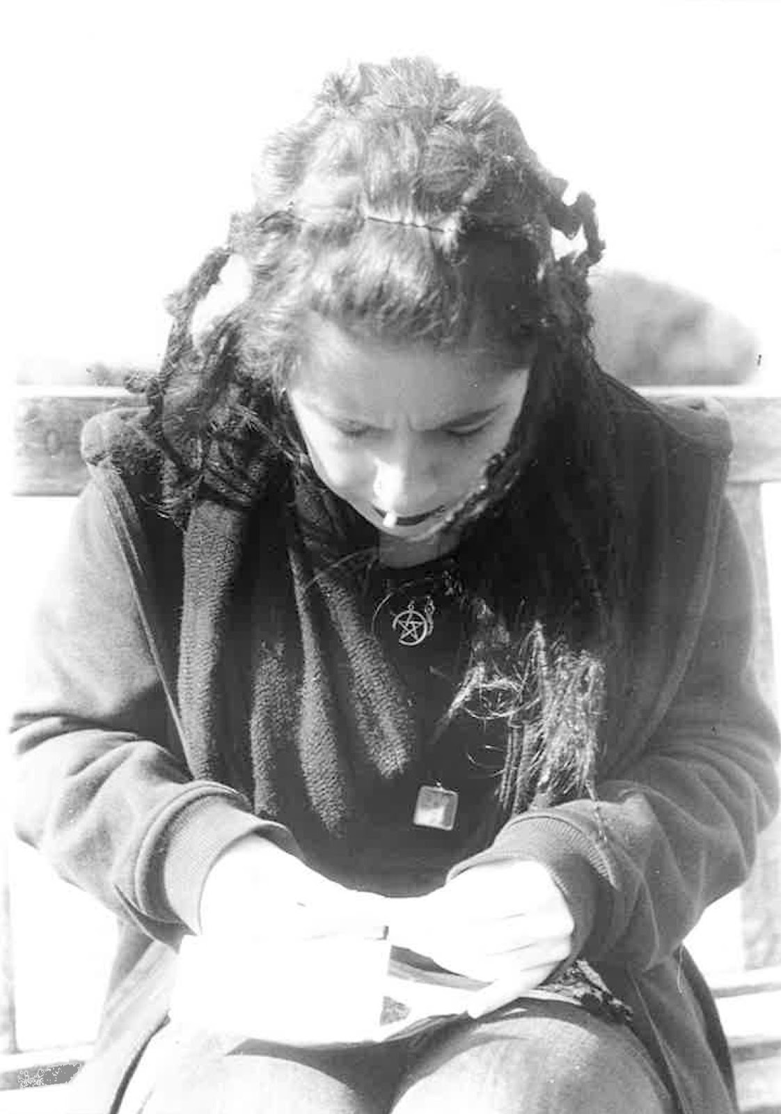
One of my favourite compositions, shows off the nature and also her hair and lipstick which I could incorporate to part of the 'product', the timings worked perfectly to create the right contrast, next time I could do a similar shot of her perhaps in the middle of the composition.
I wanted to see how the smoke effect came out in my photographs so I chose to print this one, I like how the mist creates a relaxed and eerie mood with the stillness.
Vignetting
Vignetting is reduction of the brightness/contrast around the edges of the photograph in photography, leaving the centre developed and a plain or less exposed outline, the vignette can be any shape but I chose to use a circle because it would work well when creating a softer looking blurred effect and a harsh, exact circle.
To do this -
1. I simply cut out a circle from a black piece of card, to create an equal shape, I folded the card in half and cut a semi-circle.
2. Secondly, using the appropriate timings, to create the vignette, I put it over my chosen photograph, using a sheet of glass to keep it flat if needed so that there were no blurred edges when trying to create the harsher vignette, I expose it normal like this so just the circle shape comes out on the photograph.
3. To achieve a blurred effect, instead of using glass and placing my template down, I held it slightly above (about 10cm) from the paper that I was exposing and wiggled it around keeping in fairly in place for the circle to still be visible but be blurred whilst the paper is being exposed.
 Firstly I tried the blurred effect on this photograph to focus on her rather than so much of the nature. I like it because it sat there very subtle, not taking over the image but bringing it forward and making it more interesting because it wasn't just a regular print.
 When trying the harsher effect, I thought the portraits in the studio would work better because there is already harsh contrast between her clothing, the shadows and the white back drop. The scratch son this print are from the glass because it was scratched, minus this I thought this was effective, event hough the top half was blank anyway, It still kept her sitting forward without looking too like a plain circle because of the blending at the top.
I liked this effect and plan to use it in future photo shoots I plan to take, particularly on portraits and close up compositions on the figure/face because it helps to shows profession and help them stand out as different, also can match and fit the mood of the compositions.
I tried the blurred effect on the same photograph, focusing on just her face this time so it was very portraiture like and almost framed, I think it worked well but not as well as the harsh effect because that matched the dramatic contrasts better.
Highlighting an area of Interest
Using coins, I highlighted parts of my photographs by -
1. Using the appropriate exposure time I had figured out I halved it on the timer.
2. I then exposed my paper normally for this amount of time.
3. Keeping the paper very still I placed coins in appropriate place on the paper and exposed it for the second half of the time.
 I chose to put the coins here because I thought that the part of interest was the piercings but the coins were to big for this so instead I would make a pattern on the clothing with circles, it was too dramatic and I didn't like it at all because it took away the purpose of my photographs, and also looked too random and uncomposed.
I tried to put the coins on the face for the piercings and the hair here but I thought the same of it as I did my first attempt.
Feeling no influence I didn't do anymore of these and moved on to the next experiment.
Press Printing
1. For this, once the image is exposed instead of putting into the developer, I put objects relating to the composition in the developer and placed them onto the exposed images so the developer sinks on from their shape whilst they are being pressed, the developing time can sometimes take longer than when it is put straight into the liquid because fit needs to sink in.
2. Once done I put it straight into the stop and then fix as usual.
I chose to use a comb because ever hair is one of the elements which I want to show off so it relates to this, the effect also looked like blinds which created a relaxed mood matching her facial expression, I moved it around pressing it on the paper more than once so I could fill the paper and composition to make it more interesting. The tones made it quite subtle yet effective and looked like they had movement and were flowing well together.
 Above is my favourite, using the comb again I overlapped it to make it more busy this time, also to develop most of the face so the tones come through, to relate to her piercings I also included some ear stretchers because ever ear is stretched, I used 5 of them and although I liked the idea they didn't come out that clearly because they sloped so their whole shape couldn't clearly be pressed onto the paper. Also when moving them I created lots of droplets of developer which gave them a random splatter effect which contrasted to the relaxing theme with the 'blinds'. I liked it because it really worked with her face compositionally because of her glance matching the direction of the comb, the splatters making a faded and drooping effect, also because the combs were clearer in this composition. WHen looking at it further, I can relate it to splatters of blood from piercings and connect the sharp ends of the stretchers to this.
 For this growl of anger, I cut out shattered looking shapes from card and placed them onto my paper whilst it exposed, almost a reverse of pressing wet card onto my paper which I also wanted to try. I liked the idea but this looked too simple.
I complicated it more and gave it more layers by halving the exposure time, placing the shapes around as I had done before and them without moving the paper, I moved the bits of card to a different position  so that an almost see through effect happened to them and they overlapped each other and created different tones and exposures. I liked it because it looked like she has shattered the glass and was appropriate. The composition could have looked better if she was directly in the middle of it because her gripping hand is unclear in this one.
Cropped it to focus on just her face, worked better to show just the expression and sharpness of the shapes.
Here I went back to the actual press printing. I wanted to reverse the cracked effect so I put the pieces of card in the developer to then place them onto the paper to develop leaving the cracks unexposed instead. Where some part soy the card had pressed down more than others to develop more, shades were created like droplets which I liked because they were relaxed like her expression, and contrasting well with the glass and angered effect which I choose this photograph for so that it looks like it is hiding deeper emotion or meaning.
I may come back to press printing, particularly for the glass and shattered effect because of the emotion link it has with the chosen photograph and how it gives it a good effect, although it can take away part of the image and garment/accessory in fashion photography because the change and distortion to the original could take away some important detail.
Dodging
Even if the desired effect is achieved int arms of exposure and contrast, sometimes the negatives and shot themselves can have parts of the photograph in the composition that are too dark. Dodging is when  with an object held or using your hands you can cover part of the photograph whilst it is exposing so that it doesn't get exposed as much as the other part of the photograph so we are not drawn straight to a darker part rather than the actual photograph.
1. First of all, you can make a dodger by using paper to create an end of what looks like a rod, cut out to a circle shape, size of your choice and attach it to the end of some wire so you can hold it directly above the part of the picture to want to dodge.
2. I did it myself with my hand, the same as if I were using the dodging tool, I had to keep moving my hand similar to how I moved the paper for creating the vignette. This is so the shape of my hand isn't directly seen on the final print.
3. When dodging, I didn't do this movement for the whole of the exposure time, I did it every 3-4 seconds and only for around a second each time I did it so I'm not blocking the exposure from the light completely.
On this print I had developed earlier, I noticed that the corner where a shed was and her dark clothing linked, their dark colouring was difficult to differ so it was a good subject to dodge.
 My first attempt worked a little bit but not well enough, I dodged about twice for a couple seconds during the 18 second exposure.
My second attempt I dodged as I explained before and it worked better, the shed was lighter allowing us to see her arm better so it was overshadowed.
This technique will come in handy for future reference when my photographs contain a darker part like this one.
Burning
The opposite of dodging, this is when there is a lighter part of the image that needs exposing for longer than the other parts of it.
1. For burning, I used a template similar to my one for the vignette, so that I could cover the other parts of the photograph that didn't need extra exposing.
2. I only held it there for around a second and also allowed a lot of time for the other parts to expose.


Her hair was too light compared to the rest of the photograph so I decided to burn it.
I increased the exposure time on a whole because of how it was reduced by the burning covering it, it successfuly printed her hair much more clearly with more contrast.