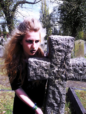
1. I opened my photograph as normal on photoshop.
2. Clicked CMD J to duplicate the layer.
3. Then I clicked the image tab, then adjustments and the shadows/highlights option.
Slide the highlights to around 50%, although this depend son the photograph, what this does is bring some of the details out in the lighter parts of the photograph, for example the sky.
5. Then do the same with the shadow slider, around 30%.
6. Then click the box underneath which says ‘see more option’. On the mid tone contrast slider, I raised it to +50 giving a strong contrast for a HDR looking effect.
7. I also played with the colour correction slider to about 10 depending on how strong I wanted the colour.
8. Tonal width gives the amount of things it sees as highlights, I played around with this and left it at about 50%.
9. The radius slider gives a blurry effect the higher you put it, I left mine at about 30% to give a slight blur like a HDR photograph would expectedly have. Click.
10. On the original photograph on the duplicated layer with my original photograph I duplicated it again (pressed Cmd and then j). Then in the list of layers, I dragged this one to the top so that it overlays all of the other layers.
11. I then clicked the filter tab at the top, then other and then high pass. A box appeared showing the layer as grey, in the radius in this box I put it to about 10 to lessen the blur on the top layer of my desired result.
12. Clicking ok, I then went to the image tab at the top, clicked adjustments and then desaturate.
13. In the drop down menu next to the layer I clicked blending options and selected multiply to join all of these layers together with their effects. Giving me a lot more contrast and slight desaturation.
14. I then clicked the layer tab at the top, new adjustment layer and then colour balance.
15. In the highlights slide I dragged my yellow and blues up, for the shadows the opposite was done – higher red and greens so that these balance out all of the colours in my photograph equally. These colour balances vary depending on the photograph but these result worked well for mine.
I started with this photograph because it could look quite good being made more sharp to match her fierce expression and the HDR effect gave off this effect in what I have seen of it in online tutorials.
My result looked quite cartoon like, the details were very clear, each small branch of the trees was visible and contrasted from lights and darks allowing them to stand out to create this. The green and the blue tones contrasted each other even if they were similar and looked much brighter and colourful. The stone was given rough and clear texture, making the photograph seem more 3D and real. Even the small strands of grass stood out. The main difference I liked about this editorial was the colour, how they were so different yet so real for example the arm was blue/purple yet it didn't stand out as unusual. The graves had a purple hint to them where the greys had become more contrasted and like black often does when overlaid on photoshop, it changed tones to something more colourful. it reminds me of painting and how colours are exaggerated when dong this for a unique and more interesting effect because of the boring black tones being so flat originally and now they have been bought forward and brightened.


No comments:
Post a Comment