Jason Christopher - London based fashion photographer, his photographs include female models, shows his own interest in fashion and this links with the social history because of the clothing the woman wears narrates well with the scene, something casual presented in a better way than what you expect it to be. For advertising the clothes, as a whole outfit and show what they can be ued for and the conditions they cope in. You can tell it is modern from the fashion and use of lighting which he has captured clearly due to technological advances, it links with modern day fashion and that is why it is neccessary to the media.
Composition isn't in line but it shows the scene behind which adds to the rural areas where horse-riding takes place, also adds strength to the clothes and their value, represents the idea of being active and on the go because it isn't too perfect, we also see the whole outfit. The photograph being small in a catolougue wouldn't work as well as it taking up the whole page because we wouldn't be able to see this scene. Colour is an important element because it shows richness in the scene and presents it positively because its bright and relates to happiness, shape is important in the model, the clothes are presented on somebody slim and attractive so that they can be seen in their best look which they are most likely to be sold. Space is very realistic, no illusion, fits with everyday life. Process must have included photoshop for vivid colour editing and airbrushing for the smoothness of the photograph, also the light beam strands.
No title shows that its not necessary because of the purpose of the photograph, it is not being exhibited or famously known. It fits in casual fashion theme, interpretations are left open, the photograph aims to sell, the narrative scene only adds to the way it captures somebodies eye and the casual look, his website includes the photograph along with all his other fashion shoots which shows that it is not something to stand out alone but just another photograph appearing in a magasine of fashion, doing something different with the scene so it stands out, it shows his experience in doing this becaue of the way it is lumbered with the other shots. It could fit into landscape too, if we ignored the fashion side and instead looked at the nature and amazing lightbeam he has captured which is rare and often photographers specialise in this if it is their subject matter. The woman looks happy, a natural pose which works well with the status for the clothing, presents satisfied customers.
My first visual reaction is that the light beam is amazing and almost distracting, I like the techniques used to capture it, I like the casual fashion look too because it was different to a lot of unrealistic looking mor esuper-natural fashion shoots I have seen, the value doesn't seem too great because of the simplicity and its purpose - how it will be used. Emotionally it is relaxing calming because of her expression and the weather/lighting conditions.
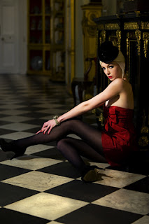
Composition is adventurous, low angle gives power to her, the legs revealed show the way women can be portrayed as less innocent and good, the path in the background shows space or a sense of being led away, no illusion is there, space is realsitic, event hough out of focus we can see what it is it just keeps our attention on the model and clothes. Colour is important, the sharp line of the floor works well with her harsh expression, the shapes are bold and over bearing representing the viewer being taken over, colours are contrasted to help this, red dress because red can represent love as well as danger, she could wear this for a lover or show women as powerful and not to be messed with. Scale should be quite large because the image is very dominating and needs to be noticed so too small would cover up the contrasting eye-catching look. Front-lighting has been used in the process to remove unwanted shadows and create an even skin tone to present the model as more attractive, the typical photoshop editing techniques would have been used for the air brushing to keep even and bold colours.
No title is common in this style of photography becaue when seen on a billboard or magasine this is not relevent. The theme is classy clothing, interpretations can be that it is aimed for higher statused people but the pose she pulls shows the strength of valuable clothes because it is more common and less lady-like. Her expression takes over and sets a strong mood and big 'encharge' statement on it which creates value in the clothes and scene they are set in.
When I first look at it I am captured by the floor pattern colours richness along with the dress, the hat and heels suggest something more sultry rather than an actual outfit, the emotion is quite romantic because of the colour and look she gives off with her face and pose, the fact she in't bothered about being revealed, it works well to advertise the product because it gives it value and an expensive look, it doesn't remind me of anything but seems quite low towards women openly looking like this in public rather than just alone, it evokes a sense of touch, coldness from the floor and large rooms in the house, but power from her lack of clothing changing her feelings of overpowering.
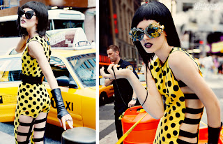
The 2 photographs work well together as one composition, they clearly show off the dress back and front, also a more close up shows a casual pose making it work better for more occasion, and shows off the accessories too. The scale could really fit in a magasine as something small or large, the dress is quite bold with big shapes so it is seen very clearly, also the scene in the background is easy to recognise even when small. Formal elements - pattern on the dress for a bold statement, very daring, colour represents something like a bumblebee, dangerous in numbers, could say something about women, it also matches the taxi which connects her to the city life, the idea of shopping in New York would be a dream come true for some women. The process includes photoshopping for a smoother texture and more attractive look, something unrealistic. Lines are harsh, it works with the contrasted colours, emotionally is strong and overpowering, this clothing makes a statement that it is different and women in it will stand out and dominate.
No title, again not necessary to promote clothing, more appropriate for promoting a documentary shoot where advertisement isn't important. The theme is high class city life clothing for women, it could fit into documentary photography if it was part of something that could tell a story in the city, but the content works well as fashion, it puts the women in the position of normal women who would be wearing it - out and shopping casually, Litchfield has chosen to do this because it is a relevent narrative for the clothing, it is quite avant-garde and represents the daring side through putting the model in a normal situation, shows the idea that looks are important and the idea of the background being out of focus and the man on the right isn't clearly contrasts him to her crazy clothing and his normal style, also gives off a sense that men would be attracted to women dressed like this and adds to factors of why women should buy this item. Her pose is very confident and keeps eye-contact showing self-esteem and why she would be promoting it and not somebody timid.
The first thing that popped into my head was that it reminded me of Lady Gaga or a bumblebee, something that would be a contemporary idea for fashion because of it difference from typical clothing, the value looks high because of the quality, the technology in the process shows that it must be something important not just any garment, the composition and idea of her travelling to NY to do this tells us it was important. Emotionally it is quite fun, it reminds women of going out for fun and looking stylish whilst doing this, I like it because of the crazy look that is put into somewhere so normal, I don't tihnk differently about it now I know where and what it is for my opinion doesn't change about it because it still advertises the fashion well.
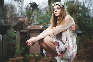
Julia Kennedy, fashion photographer based in London, clients include conpanies such as ELLE UK, Tush, The Independant. Graduating with an English and media studies degree in 2001. This shows her interest in contemporary culture which helps with the fashion industry because they want to present whats new first. It looks quite vintage at first, the flower patterns and natural background don't show relation to anything too new, although marble gravestones are slightly more modern than stone ones, the dress could be quite new or old, we only know from the recent dates that it is very new.
Process was DSLR and then photoshop, the background is out of focus but we can still see what it is it just keeps our eyes on the model because she wears the clothing and is what Kennedy wants us to be drawn to first, composition works well because she takes up the majority of space and also allows us to see a scene, we see the clothing very well, it is presented casually because it can be kept in good condition even in the way she is posing, shows good condition/material. Kennedy could have chosen to make use of this scene because the flowery gown goes with nature, but why not somewhere summery? Perhaps because this gives off a subject of death and shows her as powerful above it all, the size should be quite large, I can imagine it taking up a whole page in a catologue, with labels to the clothing because of its strong presence. Even though the contrast isn't too high, it works like this because it gives it a more relaxed and quiet feeling, no harst lines use, just shape being important in the model and the clothing where she poses, texture is smooth matching the relaxation, skin tone is kept even from natural lighting source and lack of shadow, the pink tones in the dress could represent flowers which aren't in the green nature behind. There is a slight sense of illusion because of the background being out of focus, creates distance, she looks bigger and overbearing.
No title, theme is floral clothing (fashion/femininity), shows landscape but tells us it isnt important because of lack of focus, the content narrates an idea of natural looking clothing with the scene behind, contrasts with what would usually be worn to a cemetery, makes it look suitable for anything, the photograph gives of power and seems as if the woman's mind is elsewhere - thinking of something else or looking to the sky because of her glance. I think the story could come from a fairytale, she looks like an admired female character yet doesn't look impressed with it, symbolises women's thoughts of desire and wanting something else. Interpretation is open to individuals because the photograph is onely there to promote fashion, a deeper story being explained is irrelevent to fashion magasine buyers but can be seen if you look closer into the subject matter chosen.
When I first see it it reminds me of something magical, a fairy, I've seen similar settings and styled picture from anime, it has been set up to show value to the clothes, the idea of it being in a cemetery I don't really understand because the clothes don't look appropriate for this, I like it though because her pose almost looks like flying and it gives off a supernatural element, also because of the amount of nature used, as if modern day doesn;t exist and these clothes could take you away, sensory it creates a cold feeling but strength because of the little amount of clothes she is wearing. Because of the normal setting the photograph doesn't come across as too valuable, the scene is quite relaxed and silent.
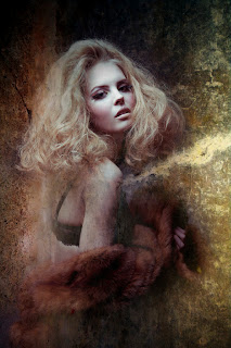
Hugo O'Malley, based in London, fashion and beauty photographer, interested in creating avant-garde genres within his works, he loves combining them with cinematic effects he also likes simplicity, which can be seen in this photograph, you can tell the date it was made because of the effects that have been edited into it, their is more of a beauty side to it, it would work well to promote make-up brands seen as its type is quite portraiture and clearly shows the face rather than the clothing. There is quite an ancient look on the wall, it links to olden times but modernises it with a contemporary look, possible one of O'Malley's genres he has attempted to create. Work has been exhibited around London.
Colour is rich but not too contrasted, her face is kept quite natural, her hair blends well with it and gives a naturist look, the colours around create a mellow smoky mood and are quite still bold although they are blended together so their is no harsh shape or line, it sits in the back ground with the model as our main focus. The process must have been quite complex on photoshop and relied on this more than a typical photoshoot, the meaning of it could be to fit with the magic, it has a hippy style in the colour and her wearing just a bra relates to relying on nature. The scale should be quite big and fill a page, make-up requires more looking and zooming than a full garment would.
There is no title on the work, a magasine advert wouldn't include one or a billboard so this is understandable and supports the purpose, I don't see it fitting into another catagory of photograph although it could work quite well as a movie poster which again presents his own personal interests being shown in his work, as well as helping a business, you get a sense of movement in the smoke along with a sweet smell quite incense like, touch from the smooth texture, it gives the make-up a look that is special and classy rather than something that can just be worn anywhere although it is aimed towards women, this would help them feel more high class and be more persuaded to buy the products because of how they are attractively presented. It is like decoration, subtle sitting in the background contrasted from her smooth texture to a bumpy old fashioned wall. Sense of illusion from her moving out of it, space is confusing because we wonder whats behind the wall.
It reminds me of photographer Michelle Moniques work, the smoky effect is like an explosion, something unnatural, like a myth or fairytale, something from a film involving creatures or darkness. The mood is quite energetic because of the various colour, the emotion doesn't create happy or sad feelings, it is powerful and sits there with confidence. I like it because of the evolving effect there is from her coming out of the wall, it doesn't look real, it all looks made up crossed with reality from the woman being there. Film lighting would be quite complicated in say an action or sci-fi scene that involved magic, O'Malley has shown that here, it is clearly edited but it doesn't look too fake in terms of her appearance so I like it, it is different


