Here I used photographs from my second film to produce random handmade experiments seeing what could look good and could trigger an inspiration.
Here I toned my prints with tea, a sepia-like effect, this brown colour along with the darker blacks represented the lack of colour and brightness in a heap of mess and this worked quite well because of that link.
Here I only toned parts of the print to let parts of the black and white peer through more to vary the tone, I felt that this worked better because it showed different levels of shadow ect. and also bought out the shape of the material in the photograph giving it more depth. I think that I would only do this again with messy subject matter because it has a symbolic/representative effect for it because it could represent rust/aged/withering.
I thought about stapling a photograph in some sort of way and the shattered glass seemed perfect for this because I could cut the photograph up and staple the cracks together in a messy 'mending' way. This worked very well because it made the smashes look even more uneven and jagged.
I extended this result by cutting the glass photograph up again and sticking the edges around another photograph, my bedroom seemed like a big contrast to the warehouse photographs so I used this, it gave the innocence of a girls room involving a teddy a dangerous and sharper effect, as if you're peering through the glass to see something completely unexpected.
Still liking the cracked/shattered idea I cut up another roy my photographs, this one was quite simple so I though I would give it a go for the different subject matter to the glass. This time I used clear tape to stick it back together which is transparent and when held upwards it is as if it is staying together naturally with nothing there.

I extended this clear tape experiment by repeating it and this time using coloured thread to fill in the gaps. I have found previous when I have tried to stitch photographs back together from the pieces that they become too floppy and hard to handle so the celotape helped me do that and also gave a shine and smoothened texture to the gaps which contrasted with the rough, fluffy look of the string I used. It was fairly thick so that I could see it very clearly so its effect was noticed enough so it would be effective and worth doing, it was fun doing this because I could gradually see it bringing the photograph to life. I could improve on this by filling in all of the gaps, I could also create a more interesting pattern or perhaps spread out the stitches a bit so that they aren't as overbearing. I don't think I will work with sewing again because of how time consuming it is and the fact the result isn't worth that long.

To brighten up this rather dull composition I briefly looked at the work of illustrator Hattie Stewart to inspire me with subject matter to draw onto this photograph. She works with graphic elements of black and white with only a hint of colour sometimes, thick lines and sharp shapes describe it well. Because it involved music I drew stereo symbols around them, I also went over them with the black pen to make them stand out in a black and white contrasted way in which Stewart does, random swirls and lines are also inspired by her work. (below). I enjoyed this because I could be imaginative and free with it, also it has a childlike feel to it because if the simple and bold cartoon like shapes. Next time I would use a photograph that has more space that could look good with more full and vibrant patterns that are more close together like Stewarts example below.
Illustration on photoshop over a photograph, thunder for sharpness, work stands out because fit makes a harsh and bold statement, out of the ordinary, fun patterns, quirky drawings. It is untitled and the purpose of what it was made for is unclear but I selected it because it was a contrast to the plain photograph I used and could fill it up and make it look better, glasses and earphones could be associated with young people and the doodles are quite a young and playful style which would bring these aspects out.

I weaved two photographs together, I used the bedroom photograph of the whole bed and the mess on the floor, this contrasted well from a homely room to a messy and dirty one that looks grimy. Texture created was bumpy and effective, weaves were slightly too neat looking for these photographs. I cut them up with scissors and used glue to stick the ends down and then weaved the other parts through. I enjoyed it and the result was good because of the texture but the subject matter was unclear, I would use photographs that show something bold that is larger and stands out in the subject matter so it can be seen properly, the small objects were either completely erased by the weave or hidden to a point of being unclear.

I also scratched though my photographs, this gave them a bumpy and flaky surface because bits kept falling off, I also found that the scratches reveal whit underneath so they look better on darker surfaces, I highlighted the branches and bits of rubbish, scratching relates to destroying and mess so this was a good symbolic idea. I am proud of this and enjoyed it, I feel the result came out exactly how I wanted it to, I could carry this on and try scratching words into a different photograph.
Here I used text with the scratching technique, the words relate to the bedroom and connects it emotionally with the owner (me). I liked this because of the contrast of the white text on the black background. I could next time make the text even bigger and more white so that it is brighter.
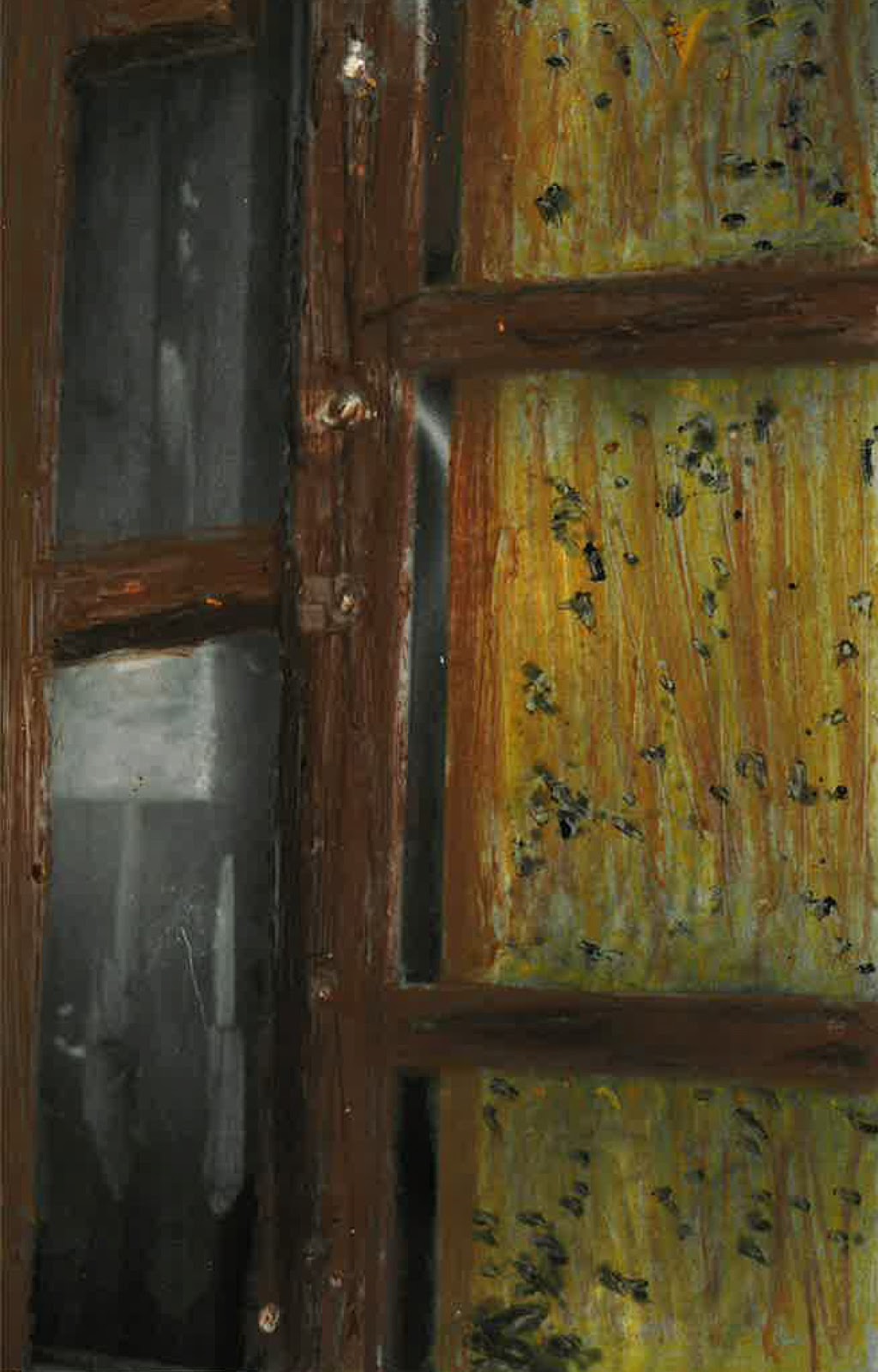
I used oil pastel to draw on my print here, this photograph of a combined space by a door was very dull and boring so I highlighted some of the shape in the composition, this worked really well because the colours were kept quite similar in spectrum (relating to the natural wood colours), and they went onto the shiny surface very smoothly and blended well together for tone. I would continue this, I will experiment with it for a final piece with the future subject matter to see if it can create another realistic effect.


No comments:
Post a Comment