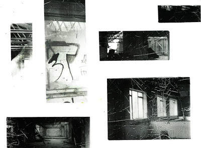
Digital Davidson Inspired Photograph
My ideas have changed mainly on subject matter. I decided my abandoned photographs were my strongest point and I developed them by looking at Alain Paiement's work. This appealed to me because it involved mess and clutter and one photograph I analysed by him was of an abandoned place in itself. The difference was his shots were mainly taken from birdseye angles capturing the mess below. I gave this a go on my second film. From Paiement I was lead to looking at Tracey Emin's famous installation 'My Bed', this captured mess randomly too but in a bedroom, I involved this on my second film too. I then put the two ideas together and thought that by framing more mess in a claustrophobic way I could involve some personal ideas to it, almost going back to inner character because I would still be focusing on the abandoned ware house but presenting it in a trapped and confined way. I have mainly experimented in the dark room at this point. I have tried liquid emulsion which was partially acceptable but could have been improved by not over exposing them, selective developing went well because I developed parts in a relevant way rather than just randomly. Solarisation wasn't too good because I didn't gain much contrast with my photographs, particularly my Rensbergen inspired ones. I did a wide range of reversals which worked very well, I reversed my selectively developed prints to extend their enhancement even more. I also reversed my solarisations of my Davidson inspired photographs which were a huge success with the silvery tones. I also reversed the digital photographs that I had printed onto newspaper. The layering of materials (rice, celefane) onto the prints didn't work so well at first, the rice needed such a long exposure time it took me very long to get it right and I didn't enjoy it much, I found the successful results quite boring too. ANother experiment was masking the prints which went well because I kept the subject matter and composition relevant.
Reversal of Selectively Developed Print
Masking Prints
Reversal of Solarised Print
Digitally I have printed my Davidson photographs onto news print and graph paper to see what effect it gives. I have dripped ink down them too and combined both these experimentations together which went well. I photographed apple peelings and parts on top of my existing apple photographs to combine colour and black and white together which also went well. I also experimented with an Ipad for the first time and captured/recorded group work with a moving imagery a similar way to a gif or cinemagraph but more movie like.
Digital Davidson Photograph Printed on Newsprint with Ink Drippings
Spaces Photographs With Apple Peelings on Top
I have experimented with cutting up my photographs and re-arranging them, I extended this by combining more than one photograph together. I followed collage tasks in group worked - cubomania and exquisite corpse which I enjoyed and a random ripping and tearing collage which was too random for my liking because of the lack of relevence. I am yet to develop my Emin and Paiement work. I want to develop moving image further, I want to try and do this with stil photographs on Imovie and on Photoshop to see what works best. I will also involve experiments such as solarising and reversing to my video results to see how I can present this well. I may also experiment with burning photographs again and photographing these results again.
Artists I am looking at now include Paiement and Emin, I have also looked at Juergen Teller and Man Ray after seeing their work on exhibiton. I also want to look at Lucy Dobinson's work which includes moving images focused on the theme of claustrophobia which would be perfect for my next step to go from mess/spaces/claustrophobia to going to involving people in this theme.
Lucy Dobinson's 'Claustrophobia' Moving Image Still
My plan for the exam is to produce a moving image at the moment, I want to experiment with how I can do this and how I can change the effects, also how I can go from recreating Dobinson's shoot to adding my own personal touch to it.


No comments:
Post a Comment