
Monday, 19 March 2012
Wednesday, 8 February 2012
Light Painting Using Photoshop.
Using Photoshop, I could create simular results to actual light paintings by drawing them out with various tools, I could start with an existing picture or work on a black background (which acts as the darkness).
The first step was to open the photograph I wanted to work on, or open a new international sheet of paper and set it to portrait or landscape when working on a black background.
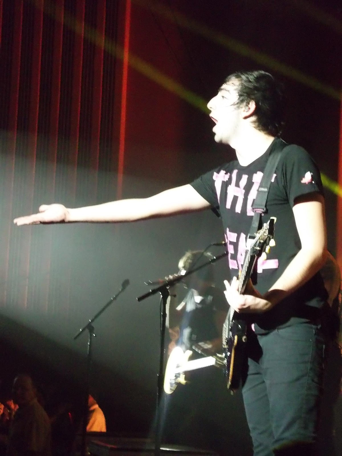
After doing this it is important to create a new layer to start your drawing on, in the windows tab click layer so that this is open for you to do so. Then using the pen tool, I chose freeform to draw my line that would then be the light (making sure this is done on my new layer so I delete it without deleting the picture/background if anything goes wrong). Afterwards, on the windows tab open the brush palette and paths. On the brush palette you can choose the colour you want you're light to be, I also edited the thinkness, added a jolt to it by changing the scattering which appears on the layers tab if you select blending options. For the light to look more realistic, you can add an inner and an outer glow to the colour and size of your choice, I made my outer glow lighter for a more realistic effect and also tried it the other way around. Once happy, on the paths tab your pencil lines should be seleted, click paths and stroke path, select brush and make sure stimulate pressure so the brush creates 'light' that is of equal pressure. This converts the brush settings into the line so that it now looks like light. As you can see from my examples below I have also added dots and other various light shapes, I did this by clicking on the brush and putting a high amount of spacing so as I draw spaced out dots are created, I also adjust the size of the dots and used different ones in my light paintings.
For my first attempt I just created a basic load of random lines to see what effect it made on a photo with a dark background, I preferred the real light drawings because they obviously looked more like light.

For this one I used my portrait photograph of my cousin, before I started I used the image tab, then adjustments then hue/saturation and selected the colourize box, I then chose the colour I wanted the image to be rather than black and white or full colour because I thought this would go well with the colour of the light chose.

I did the same for this one but chose a brighter colour, I liked what the light drawings on photoshop could do on top of existing images because I hadn't been able to try this out practically for myself, I also thought it looked more effective than a plain background because the image is clearly on show, the colour of the image also relates to the colours that would have been created from the light if it was used for real.
Monday, 6 February 2012


Tuesday, 24 January 2012
Scenary Photograms, Reversals Showing Day And Night.
I wanted to look at light as an art approach too and noticed Vincent Van Gogh's way of presenting it with oil paints. This painting 'THE CAFE TERRACE ON THE PLACE DU FORUM AT NIGHT' 1888, shows an evening in France, it shows the light from the building on the right because of the difference in those warm beige tones compared to the blue presenting the darkness of the night time, stars are also captured by exaggerated splodges of white. So artificial light and natural light are shown in van Gogh's painting here.

Here is the same scene but this time drawn in indian inks, I can tell it is night time still because of the dark line strokes Van Gogh has used to present the lack of light in the sky, the thinner more spread out strokes suggest more light, for example the ground, and even the buildings on the right because no lines have been marked into their actual space, so this matches the painting in terms of this being the part of the picture that light hits. From the lamp sketched I can guess light is reflected from the cobbles on the floor, but not as much as the bulding.

This inspired me to sketch the outside of my back garden ann house in the evening. To produce a more solid affect on the light and dark parts of this I created a photogram by drawing the scene on acetate with a permanent marker and producing this version showing night time, and a reversal that focused more on day time.
 Above is the reversal.
 Here is my first attempt of the reversal that was over exposed because the light was on too high, presents another way of showing the 'evening'.
 Here is the night time one which was the original photogram made from the drawing on acetate.


Sunday, 15 January 2012
Different Types Of Lighting Used In Photography.
Light is pretty much the most important source for photography, without it no photographs would even be visible. Different types can be used to create different effects with various sources. If you click on the pictures you are taken to the website of their owners.
Front Lighting
This light is aimed at the subject of the photo in the same direction it is being taken, for example next to the camera. This differs the background colours (more dark) to the subject of the image which the light will shine on and brighten for the photograph, can result in particularly flat effects though.

Back Lighting
This is the opposite of front lighting, the source of light whatever it may be is aimed behind the subject so that the background is more bright/illuminated than the subject, particularly good when wanting to create silhouettes of the subject, so for example would not be suitable for a high quality portrait photograph. it can also create a glow around the edges which can be particularly effective.

Soft Lighting
This lighting comes from a large source or even multiple sources, this is so that instead of resulting in harsh edges and contrasting colours that one single light beam would, it creates more of a soft natural looking effect, e.g the similar effect fog gives to natural scenes, looks more gentle on portrait photographs too but can make some detail quite minute.

Hard Lighting
This comes from a single light source such as a light bulb, it falls on a particular object with no reflections/different directions in the way. It creates dramatic shadows that are shown in full sharpness making them seem harsher and more contrasted with the lighter colours in the photograph.

Studio Lighting
Although going by the name, this lighting doesn't need to be set up in a studio, these lights can be strobe lighting, fluorescent or HMI mainly. The light sources can be dimmed/diffused by being reflected off of other surfaces such as umbrellas, soft boxes, so that the effect is still there but less harsh, works particularly well in black and white because of the shadows shades, also for fashion photo shoots.

Natural Lighting
Very accessable, no artificial sources needed, makes use of the worlds natural lighting which is either sunlight or moonlight. Brilliant for outside and landscape photographs.

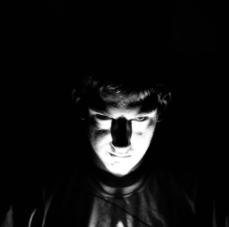
Torch Lighting
This creates a spotlight effect, most useful when say illuminating a certain subject whilst taking a shot in the dark. (photo below taken by me).

Laser Lighting
Created by laser pens, can be any colour at all and usually used for light paintings (some which I have tried to produce myself), creates a harsh bright line in contrast to darkness (where it works best by far).

Front Lighting
This light is aimed at the subject of the photo in the same direction it is being taken, for example next to the camera. This differs the background colours (more dark) to the subject of the image which the light will shine on and brighten for the photograph, can result in particularly flat effects though.

Back Lighting
This is the opposite of front lighting, the source of light whatever it may be is aimed behind the subject so that the background is more bright/illuminated than the subject, particularly good when wanting to create silhouettes of the subject, so for example would not be suitable for a high quality portrait photograph. it can also create a glow around the edges which can be particularly effective.

Soft Lighting
This lighting comes from a large source or even multiple sources, this is so that instead of resulting in harsh edges and contrasting colours that one single light beam would, it creates more of a soft natural looking effect, e.g the similar effect fog gives to natural scenes, looks more gentle on portrait photographs too but can make some detail quite minute.

Hard Lighting
This comes from a single light source such as a light bulb, it falls on a particular object with no reflections/different directions in the way. It creates dramatic shadows that are shown in full sharpness making them seem harsher and more contrasted with the lighter colours in the photograph.

Studio Lighting
Although going by the name, this lighting doesn't need to be set up in a studio, these lights can be strobe lighting, fluorescent or HMI mainly. The light sources can be dimmed/diffused by being reflected off of other surfaces such as umbrellas, soft boxes, so that the effect is still there but less harsh, works particularly well in black and white because of the shadows shades, also for fashion photo shoots.
Natural Lighting
Very accessable, no artificial sources needed, makes use of the worlds natural lighting which is either sunlight or moonlight. Brilliant for outside and landscape photographs.

Torch Lighting
This creates a spotlight effect, most useful when say illuminating a certain subject whilst taking a shot in the dark. (photo below taken by me).
Laser Lighting
Created by laser pens, can be any colour at all and usually used for light paintings (some which I have tried to produce myself), creates a harsh bright line in contrast to darkness (where it works best by far).

Friday, 13 January 2012
Portait Photographs.
Experimenting with studio lighting using the DSLR camera. we had 2 umbrellas with lights available, I experimented with changing them and my friends positioning with them.

Light on right side only, creating a shadow of her behind.

Landscape composition shows the background more showing the lighting created with this positioning of the lights.

Both lights on giving a softer effect, no harsh shadows more gentle and light.

Light on left side, turned away a little, creates a harsher and darker shadow because of less light.

Both lights again, gentle poses match their natural result.

Both lights turned away slightly, face looks darker and shadows more contrasted.

Light on the right, odd composition, half background space and half my friend, not much shadow created because of the light positioning, instead more bright on the wall and darker on the face.

Attempt of back lighting, silhouette desire didn't work although it gives it a more night time effect rather than a usual photo shoot like the softer lighted portraits earlier on.

Same lighting but a close up, not as effective because of the focus on the face isn't clear because of the darkness and it should when close up rather than showing anything in the background either.

Left light only on, bright beam seen on background reflection, darker the lower in the composition which I liked.

Tried an earlier pose again, this time the light was aimed more at her rather than turned away so more of a shadow was created which I liked because we can see different shades of light.
Below are the same photographs, edited in photo shop with contrast and brightness adjustments and converted to grey scale. I preferred this because it shows the lighting more effectively because of the the added contrast, it also looks more professional because of this, it brings out the effect of the studio lighting used. It especially works better for the back lighting photograph, the face looks more like a silhouette and the brightness added shines through around the shape more, making my aimed effect slightly more effective.


Subscribe to:
Posts (Atom)