Here I started experimenting with my ideas for my final piece to see what would work best and what materials would give me the best results.
I started by simply printing off a variety of my digital shots and placing them in a chest of drawers to give the idea that they are reaching out and to see what would work best.

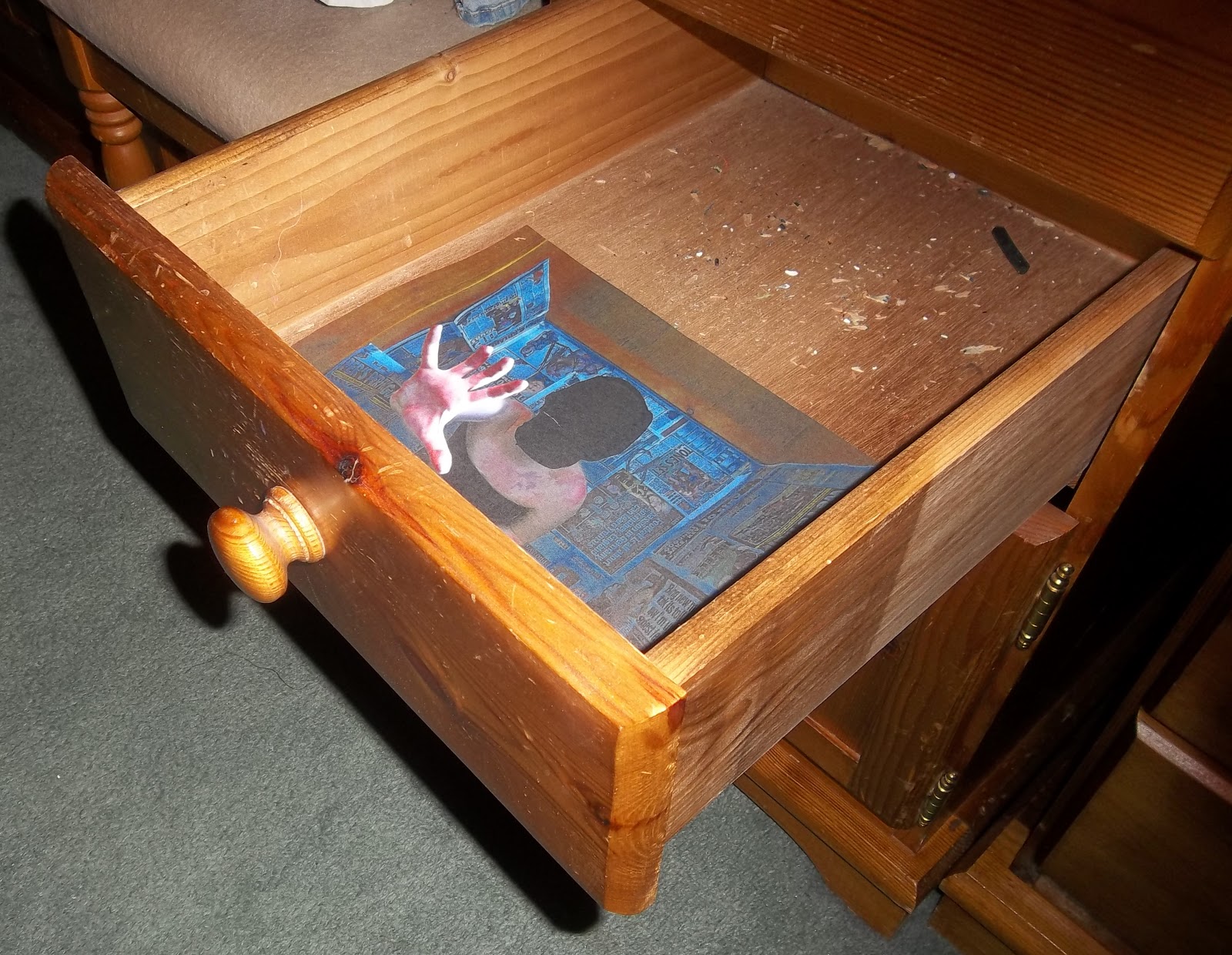
Hand pushing out, wooden tones are the same on the drawers and on the edges of this photograph which works well, gives an illusion that it is 3D and actually there.
Here I photographed it from another view just to see if the illusional effect would still work and it did, also to see what my viewers would experience when first looking at my piece if it be this.

Newspaper print didn't work as well because the colours of it and the wood didn't sit well together which meant this looked randomly plonked in the draws rather than being effective.

Ignoring the fact this print is too small for the draw, I also felt the colours clashed again, a black or white set of drawers would be needed if I was to use these photographs or my darkroom prints as they would be black and white because of the developing chemicals in college can only produce black and white prints. I felt it could work well though as she looks like she is pushing the actual wood of the drawer.

I felt this set worked well before so here is another composition, this time both hands are pushing upwards, it makes us feel as if somebody is trapped just like I aiming for so it is effective.


Here I filled the drawer with two photographs again see as this was the most successful result so far, this time from different shoots, the same as the balck and white not matching the drawers, the colours of these photographs didn't match or sit well with eachother, the scale of her is also too small in the black and white photograph compared to the newspaper one which makes it look unrealistic. The shadow captured in the photograph of the close up creates depth and looks good because it matches the shadows in the actual photograph.

The blur worked well because it didn't stand out too much instead it gradually blended the tones from her body, to it being transparent and then leaving just the wood which matches on the drawers and in the photograph.

This confirmed my opinion stated before - that photographs from different shoots shouldn't be used together because of the unrealistic vibe it gives off because of the colour clash and in this case the techniques clash too.
I then used the headlines image I had found for my experimenting with it in photoshop and printed it, cut it up and placed it randomly on my photographs as other enhancment.


Here they stand out a lot, a bit too much and too distracting from the original image.
This experiment became quite repetitive and I didn't think it made the photographs look much better and I thought that they could do without them, Although I photographed them in the drawers to see if this would change anything.


I don't think this made a difference or improvement to the text experiment because it made it look unrealistically in the draws and took away the illusion effect and made it look quite tacky because of the font and the boldness drawing us to the words not the image content.
I then decided to experiment with cubomania on my images, I cut them up into squares this time seen as I have already experimented with ripping them randomly, I felt the rips could become too distractive of the image and the dquares could seem more stiff and tight rather than free and random which represents the inner content of the photographs.

Black and white mixed with colour so that the separate pieces stand out, I learned this from the experimenting I did before, the different tones worked well this way. I liked the cube shapes and the way they created a stuck movement. Also the odd scale and positioning of the arms, hands and feet, it was unrealistic flexibility which is usually related to mental cases which could represent the trapped feeling.

I don't like it in the drawers because they're realism point needs to put across and this doesn't do that.
I now decorated the drawers with the text to see if they would look better plain or covered.


It looked too crowded and unnecessary, it looked tacky and didn't give away what was inside but made it very clear, it didn't look creeping or intriguing it just didn't work because of this, I feel that scratching into the draws could look quite unnatural and scary but also subtle which would work well, if I decide to do this for my final I will take that into consideration.
I wanted to improve my favourite GIF and make the background seem more still because this would be better if I decide to use it in my exam.

The framing had to be tighter for me to even the background out, I did this on photoshop by starting with the first picture and opening up the other photographs in a separte document and lining the background elements up and cropping them until they were the same size, this gave me a more accurate result.
I wanted to enhance my gif more so I decided to see if I could combine the blurring effect with it, I did this by creating the blurs by opening the first still photograph, then dragging the next one on top of it as a new layer and lowering the opacity again, I saved this and then opened the original still of the photograph that had just become the transparent layer on the first photographs, I used the third photograph in the dequence to be the transparent layer this time. This pattern would carry on until the end of the photographs, I stopped after using 5 images to see if this theory worked or not. I closed everything on photoshop and clicked the window tab and opened animation to begin creating the gif. My still photographs I used were named 99, 001, 002, 003 and 004, in this order I loaded them to become a gif but between each of them I opened the blur combination of two of them.

Here is my result, I felt the stills were too long and the blur wasn't emphasised enough to reach its full effect.

I liked the solarising on my gif from the previous set of my Dobinson inspired photographs so I thought I could experiment with my negatives in the darkroom starting by solarising them. I chose the solarising time and lighting strength (F) randomly because I have never known what make a perfect solarisation and I wanted to find out.


4 seocnd exposure, F8, filter off. I loved the tones on the back here, my first solarisation that I don't think I could improve on because of the contrast and all tones when solarising are seen here.


3 seconds exposure, F5.6, filter off. Could have dodged the left side background, too dark, tones aren't bought out enough.

Out of all of these experiments I feel that my solarisations, images placed in the drawers and blurred gif work best. The gif shows digital ability and the use of photoshop whereas the solarising shows advanced and accurate use of the darkroom. To conclude, I will produce a blurred gif and a photo covered chest of drawers (including solarisations) for my exam piece.
No comments:
Post a Comment