Using my digital photographs from my reshoot I decided to make a gif because I knew that my results would be more successful because of the framing and lack of distractions in the background composition. Each gif was created in photoshop by selecting the window tab and opening the animation bar, by clicking the file tab, then scripts, then load files into stack and loading them in the order they would be in for the gif. Then adding new animation slides and hiding each layer one by one, the same method I have used in my earlier gifs.

First of all I used my 3 coloured no flash stills. This was only a short gif so it needed to be fast so that this wasn't to obvious and it didn't look like a slideshow. The speed was 0.1 seconds. I liked the emphasis on the pink and blue tones of the skin, also the contrast between the top of the background (which is light) and the bottom which has a gradual deep shadow like the photographs and this shows it off more, the head is the darkest part and is what we are drawn to first.


Black and white flash on photographs. I don't feel that the clothes stand out as much because of the dark background, the same thoughts as the photographs. I prefer colour for the gifs because it enhancing the tone soy the skin. Although this feels like she is moving in a box and it is dark with a torchlight shining on her because obviously colour is dimmer in the dark. The timing is 0.1 seconds per slide, which matches the carrying/moving effect because she would be falling around and moving more quickly than normal, I like this aspect of the gif but would prefer it in colour. I'm not sure why but I only noticed the carrying/moving in this gif, it sprung straight to mind whereas in my colour one above this it didn't.
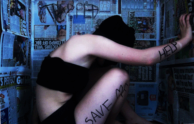
This one is my favourite, the still photographs were my favourite stills so I hoped this would work. It is fast at 0.1 seconds per slide and this creates the panic which is needed to support the narrative of the words in the background and the meaning of the newspaper I tried to put across. The lighting is what set it off for me, the blue coldness. The positions I have used accurately show of the words clearly, also I have composed the shots to include stretching of more than one limb for a flexible and inhuman spider sort of look, also curling up to contrast this and gradually stretch out as if her energy and strength is bursting and this present shed desperation to get out. The background moving slightly is still an improvement from before and creates a windy effect, as if her movements are making the paper blow around.

I enjoyed making these because I felt they were more successful and I was enjoying seeing my results, the fourth gif I wish to continue experimenting with and improve it because I feel this has potential for a final piece or part of one.
No comments:
Post a Comment