'Destroy', Rankin and various artists.
Youth Music, a charity hosting various music events and supporting young people to fulfil their dreams, teamed up with fashion/celebrity photographer Rankin and using his portrait photographs various celebrities 'destroyed' themselves or others in various ways, this caught my interest because of the art involved and how each one was unique in their own style. Made in 2009.
This photograph originally by Rankin, has been tranformed or 'destroyed' by Alex Zane, English TV presenter and DJ. From his occupation you can tell he must have a sort of interest in music which could explain why he was keen to take part in the project, also the fact he had previously been photographed by Rankin, also because young people will most likely be aware of him the project may appeal to them more. It links with music culture again because of his background, which links with young peoples social backgrounds when they are interested in the same thing, it is fairly modern so it doesn't link with historical culture. Its purpose was it was created to celebrate Youth Music’s 10th Birthday, 70 of the world’s greatest musicians and visual artists have created a groundbreaking body of collaborative artwork based on Rankin’s iconic portraits of musicians. As part of National Youth Music Week 2009, Youth Music will take over Phillips De Pury London for a festival of art and live music. Some of the other original works in the projectby Damien Hirst, Douglas Gordon, Debbie Harry, Michael Stipe, U2, Mat Collishaw, Marianne Faithfull and many others will be auctioned to support the charity. It links to quite a few other arts of the time such as fashion because of the celebrities who may have modelled are involved, music because of the artists themselves, films because of actors/actresses. Because of the wide range of peopel involved it can appeal to a wider audience because it is very different event though all of the works are part of the same project, people are likely to find something or someone that they take interest in. When looking at this photograph inparticular, even though the same goes for the rest of the project we can tell that it is modern because of Zane being involved and the qualities of the camera, the photograph is very clear and looks airbrushed which means more modern technology such as photoshop could have been involved in the process.
Aesthetics of the piece such as formal elements that can be seen are the texture of of the flesh paint, it looks like it would feel exactly like what its meant to be, the bleeding veins that are on show, tone adds to this because it gives it the real/three dimensional look even though it also looks quite cartoon like, there isn't too much detail but enoughf or it to work. The colours used are power and rich such as the reds we can see and the deeper blues used for the veins, they make a pattern out of lines that looks like dna shapes for the vessels, the picture is quite still even though we imagine is to be alive because of the veins we see. The composition is structured rather than random, half of the picture is the reality underneath the skin and half is what we see, this is to purposely show both sides of this, it works more effectively the way it is split into half and half than if it was randomly divided, it looks mor elike 2 different people showing the differences Zane wanted to present. The actual portrait photograph takes up the majority of the space it uses, its simple black and white effect combined with the coloured flesh is very interesting and fills the whole composition without it looking overcrowded. There isn't really a sense of space in the work, neither an illusion but it does look like something unreal and rather odd, monster like with the teeth peering through and the messy yellow background that could represent the mess of the blood. processes of the creation were obviously first of all the photograph and editing itself, a professional DSLR would have been used by Rankin, the second part would have been the pen and ink by Zane to create this inhuman looking mutilated effect, the final was a proffessional inkjet print on archival paper. These materials were most likely chosen because it gives it the best look because of the quality of the printing of the photograph, also the inks are easily smudged to create the flesh colours over the top. The works original scale is 20x24 inches, this size is perfect because it doesn't need to be too big because we wouldn't be able to focus on it properly like for example a tree landscape which could work larger, also not too small because then the patterns wouldn't be noticed as much.
The title isn't really significant, it just informs us of the individual being Zane, the main title comes under the whole project, the mutilated flesh relates to destroying, Zane has 'destroyed' half of his face, I don't think the title changes the way we think about the work but it changes the whole idea of its aim, we probably wouldnt think instantly of destroy without the title, it is also appropriate for the project, it gets many ideas going and could mean pretty much anything in a sense of how the art is presented and effects created, it also fits the whole theme of the project by destroying yet also contrasts it by using famous successful people. This photo can be interpreted in different ways, you can look at it in a scientific sense in that it could present biological structures, or as something from a horror movie rather than a specific structure. Although Zane quotes on the piece "I went to medical school, and dissection and the anatomy of the human body fascinated me. I thought that taking the skin off the face to reveal the mass of intertwined organs, tendons and bone would be interesting as a contrast to the monochrome of the photo. I think we spend so much time colouring, styling and grooming the surface of our faces to give us our individual identities, but a centimetre deep we all look pretty much the same. Mainly, though, I just wanted to see what I’d look like as a zombie." Which gives us the direct source from the projects official website, it shows more of his background life and how he was personally inspired to take this route on his piece of art for the project, it speaks truth on appearance and also his own curiousity for looking like a zombie which can add humour to the piece just like his shocked facial expression does, it fits with the audiences reaction to the piece. The type of art that it is fits with more than one type of media (mixed media) photography (portraiture) and flesh painting with inks adds to the creativity and transforming of it from a normal photograph. Zane presents his childhood interests in this piece, it can easily be looked over but when you read into it, it all makes sense in terms of what he was trying to and his approach, its quite gory, almost gives it a sense of smell and touch to the open flesh, in a way it is symbolic to the reality of human simularities, we would all look like that underneath our skin, which is unpleasent yet overlooked. Rather than people it is a person involved, Zane is the focus and it keeps all of the ideas based on him as an individual rather than an active crowd of people.
Personally my reaction atfirst drew me straight to the flesh, I liked the weirdness of it in a sense that it was bright and a realistic yet cartoon approach, humourous and gory at the same time, I liked it instantly, after reading Zane's opinion on it I like it more because that makes sense to me and I also have an interest for science.There is a sense of touch, as if it would have a squidgy texture on it, it is more a still photograph of personal ideas rather than a particular narrative. Emotionally it doesn't create any particular happy or sad feeling although it is humourous and odd, so more of a smile than a physical feeling. It doesn't remind me of anything I've seen before, it is unique to what I've seen, I would like to try something simular with a photograph of myself.
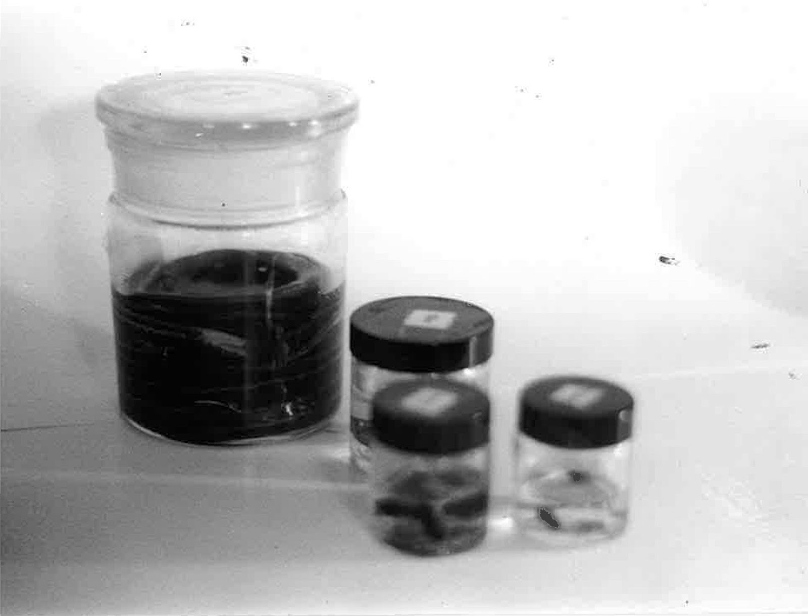
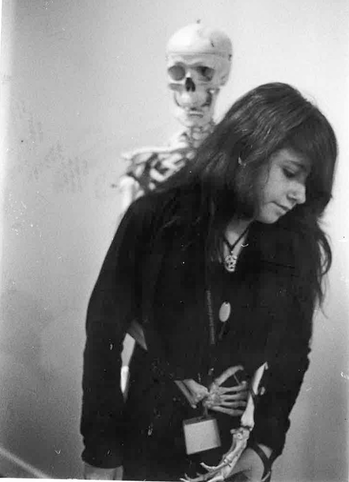
Below I took some photographs of myself with different emotions and experimented with 'destroying' them to see what I could do, I took inspiration from some of the existing pieces.
Confused emotion showing staples presenting ripping of the mind/emotions, shattered.
I liked the idea of extreme emotion so here I approached my art side more, barbed wire styled as fencing, sens eof being trapped, black smudges for a rainy/depressive look to match the sad emotion on my face, mirrors broken show shatters and also red splatters present blood for a more dramatic effect.
I decided to go completely opposite to the depressive emotions which seemed easier to present and with a shocked pose, try and represent a teen like reaction to a night out, make up, lip stick and drink showing a quirkier happy experiment which I was happy with. In terms of the theme it can relate to experiences in terms of emotion, also perhaps the result of an encounter.