Solarising
I began experimenting with my photographs further with ideas in the darkroom, I started off with simple solarisations. I felt my Davidson inspired photographs would suit this experiment best because of the dark subject matter already in them, grey/silver tones could present this and make them more eerie giving a sense that it could be night time. I used filter 5, f5.6 for a second to solarise these.


Selective Developing
Here I exposed my images for the appropriate time I had used originally but splattered the developer over the paper after exposure in an appropriate way. I used the abandoned ware house photographs because I thought that the sprays/dots ect. could represent the graffiti and mess around the place.

Splattered and dripped this one randomly, didn't really think about the composition or meaning.

Second attempt - I developed the graffiti and had drips coming off it all around to fill the whole composition with the effect but also leave parts out to make it look purposely done like the graffiti.

Here the rectangular shapes fitting together in the original photograph worked well to have the developer dripped down in a vertical direction creating other long shapes but looking like ripped down wallpaper giving a ripped and ruined texture like the wooden rectangular wood.


Laying Materials Over the Photographic Paper Whilst Exposing


I decided to create a photogram effect on my photographs as they developed by the appropriate exposure time by laying different materials on top of the paper. I used the warehouse photographs because the textures I hoped to achieve (rough, bumpy ect.) would work best with the mess and desolation of this subject matter.

I found the outside of a large room fan and lay this onto my paper, the lines created didn't really relate to the composition of my photograph because of the round line involved which contrasted the sharp edges of the building.

Here the space around the photograph that wasn't the light involved softer lines which I thought could work better than the previous photograph, it did and I liked the result although I couldn't justify a meaning to it other than the metal being layered over the destroyed materials.


Most clear in composition because it took over the bubble wrap, the wrap wasn't as over bearing here as it was in the others and I liked this.
Laying Materials in the Negative Carrier Whilst Exposing
This time I decided to experiment with the layering of materials on my photographs by putting the materials into the negative holder on top of my negatives instead of on the paper.

I used rice and at first nothing came through the grains except a slight part of the picture on the right, I had to extend the exposure time from what I used following the original settings I found, I also loaded more rice into the carrier so that the parts of the picture seen in the negative space wouldn't look over exposed.
Liquid Emulsion
I wanted to see how my photographs would look printed on different materials to photo paper by using liquid emulsion. To prepare the emulsion I had to sit the bottle in hot water to transforn the solid it was into liquid. I had to spread this onto the paper I was going to use (I started off with plain white to make sure I was successful before I went onto any other materials (e.g. wood/metal). I made sure I did the spreading in the darkroom because once the emulsion liquid has touched the surface/material I would be printing on it is the same as photopaper - it will be fully exposed and turn black if it comes into contact with light. The next step is to let it dry completely on to the surface before exposure and then expose it using the same times as you would normally to develop your photograph onto photo paper.
My results below look quite scratched on because the paper bent so much when covered in the emulsion that I needed to lay a sheet of glass on top of it during exposure which had scratches on it.
Because of the abandoned ware house photographs being my strongest I found that the majority of the experiments I wanted to do would work best on them because of how I can relate it to mess/burning/ripping ect.


Here the image didn't come through all over the page, this meant I hadn't spread enough emulsion on to the page to allow developing.

Here my image was over exposed, there was also perhaps not enough emulsion on the bottom half (mainly the right side) to let the image be exposed enough on this part.


Here is my second attempt at solarising a liquid emulsion, it worked because I can see the windows but perhaps still needed to be exposed less and also I knew I would definitely need to use more emulsion on my paper for even results of the image.

The last sheet of emulsion I had prerared I wanted to develop another experimentation I have already done by trying it out of this - selective developing. This worked very well, the original exposure time for this worked perfectly and this would have been my best emulsion print if it was developed fully but also like this, the messy developer and the scratches created a ruined effect just like the subject matter, the paper had a rougher and lower quality effect to it on all of these prints which also supported this.
I wanted to improve my results and take this experimentation further but due to the limited amount of emulsion and the expensive cost of it there wasn't enough for me to produce more at this stage in the project, I will keep it in mind for the future of this project if any more of it is purchased by the college.
Reversals
Another rather simple experiment but I haven't explored reversals as much as I would have liked to in the past. Reversals are where the black and white tones are reversed so imagine a normal print but the black turns white and the white turns black. They are created by facing photopaper upwards as normal but with nothing in the negative carrier, you then lay the original print of the photograph you want to reverse face down onto the photopaper and expose, I stuck with filter 5 and f16 for maxiumum contrast and did a test strip of each different photoshoot to estimate the correct timing settings.

I began using a digitally printed photograph to reverse, the detailed tones on the hand worked well but the shirt being completely black came out too white which looked too plain, also the dots looked too basic compared to the hand.

99 seconds, f16, filter 5.
I liked the tones of the trees here, it reminded me of night vision, his body and face looks quite cartoon like compared to the background of this photograph. The smoke tones faded to black which I liked too.
Test strip done in sets of 10 seconds, 60 seconds was the right timing (f16, filter 5 for maximum contrast)

60 seconds, f16, filter 5.
I actually preferred these reversals to the original photographs, they looked darker which made them seem more mysterious.

60 seconds + 100 seconds burning on top/middle right side, f16, filter 5.
I liked the dark negative space more than the white here because it made the scratches/ripped effect on it look more evil and spooky.
The fan looked quite fence like, like a barrier between the photograph, as if someone was trapped behind it and the lens/photograph represents their vision.

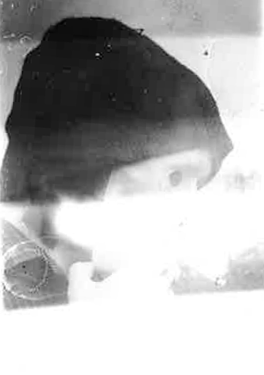
The dark space here looks very mysterious and is also quite unclear, the spaces leading to other rooms are dark which makes this seem like night vision.

60 seconds + 70 burning on right side, f16, filter.
The bubble wrap was much harder to expose at the right time because of it being thicker on the paper compared to the fan when originally exposing. I needed to burn it a lot, I didn't like this reversed, I preferred it originally because of the lack in tone.
Here I reversed my reversals of these again, I knew the colours would be realistic how they originally were but some of the detail would be gone from the small lines and lighter tones not coming through on the reversals, I was correct, this stencil like result reminded me of stencil work by artist Banksy.

I did the same as above with this one, I found that this one was even more stencil like. The absense of detail in the face worked well with the faint shapes of the trees.

Here I reversed my digital photographs (with ink dripping on them) printed on the newspaper. I liked the result, the lines of the trees were very graphical and sharp, as was the formal font of the newsprint, his face looked creepy and the drips looked more like a cage because of becoming slightly unclear.

99 seconds + 50 burning on shirt, f16, filter 5.
I really liked the rough looking texture created here on the background, the newsprint faded in with the trees and created a stone wall illusion.
300 seconds, f16, filter 5.
I decided I could combine more experiments by reversing solarisations. I preferred this to my original photograph and solarisation. The tones on the hand were enhanced and also realistic and the shadowing on the face was contrasted, the shirt and hat became light because of the tones being reversed but this balanced out the black and white well so that one wasn't taking over the other, the depth of field also added to the advanced look of it.
Here the reversed solarisation worked very well in detail to the trees and his clothing, it contrasted the creases and every blanch, the face came out rather blurry because of how it was on the solarise photograph.
Masking Darkroom Prints
This is where when exposing the paper to produce a print you mask part of it with paper preferably so that this part isn't exposed under the light and is left with no image on it. You can mask squares, circles or any shape, you can cut shapes out to have them exposed instead of the outside as well. This is what I did here, I accurately measured out 4 squares on this piece of black paper ready to exposed my images through these window like holes.
 I could expose any of my images so below are test strips of my Davidson and Rensbergen inspired photographs, I had to do this because the sizing of them were approximately 6 times smaller that the original prints I did of them (the timings for the larger ones are written on this blog), this means that the light on the enlarger is a lot closer to the paper which means exposure time will be less because the light gets to the paper much quicker. Each test strip was done in seconds, I automatically used f16 and filter 5 because I have always found this gives me the best contrast. Under each small version of my photographs I have written the best result of exposure time judging by the test strip itself.
This is where when exposing the paper to produce a print you mask part of it with paper preferably so that this part isn't exposed under the light and is left with no image on it. You can mask squares, circles or any shape, you can cut shapes out to have them exposed instead of the outside as well. This is what I did here, I accurately measured out 4 squares on this piece of black paper ready to exposed my images through these window like holes.


5 seconds, f16, filter 5. 6 seconds, f16, filter 5. 4 seconds, f16, filter 5.


6 seconds (dodge on left), f16, filter 5.
5 seconds dodge of left, f16, filter 5. 5 seconds, f16, filter 5.

(Notice that the scratches on the images are from the glass sheet I lay over the exposure paper to keep it flat to avoid blurinness, they added a good effect as if I had scratched into the photographs myself for a ruined or old effect).


I did one more mask of using the same photograph but this time with an abandoned ware house image. I felt the mysterious scene of the photograph was emphasised by having four of the same image.


Here I used different images on each window with my other photographs. This worked well because it showed more of the ware house, different scenes of the same location so the viewer can put themselves into the scene more realistically.

Here is another stencil I cut out to mask more interesting shapes onto my exposure paper. The squares are different sizes and dimensions which looked quite abstract but also looked like it could work.

I started by suing the same image. I felt that the eyes being hidden took away the mysterious vibe of the glance.

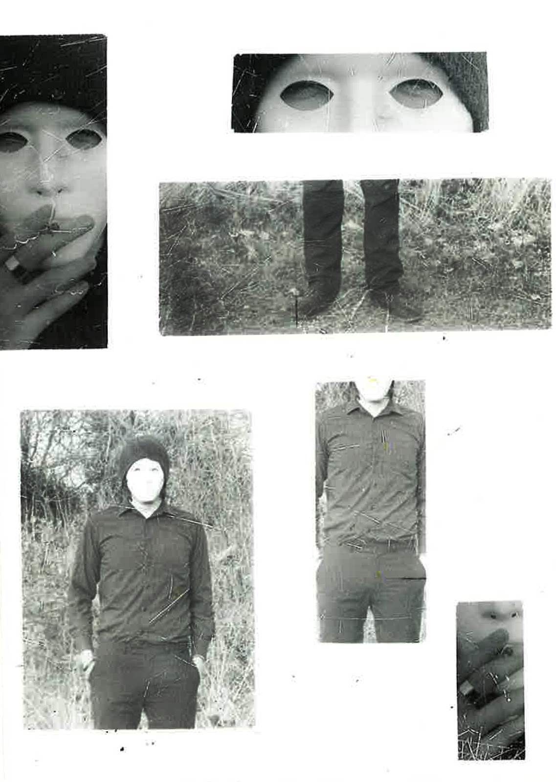
Here I used different images, I only exposed parts of them into the windows, I felt the eyes were worthy of a close up, the cigarette added to a spooky vibe so I included this as a close up too, a full face shot and body shots to break up the photographs into the most important and personal parts.

Here I used one image from my abandoned photographs. It looked at if the photograph had been cut up or shattered in an accurate way which would be impossible.

I used different photographs here, I felt that the panoramic framing of the bottom left photograph worked really well. I actually preferred the result above this one, I felt that the random rectangles didn't do the images much justice because it limited what you can see in them.
No comments:
Post a Comment