Looking back at my 'Life Cycles' mind map of ideas, I quite liked the route of showing life cycles (life coming to an end) by photographing a graveyard because it represents death, it gave eerie images and a dark feel to them, different to anything I had ever done before. here are my results from a 14 mega pixel digital camera. Black and white fitted the dim theme better and contrasts the colours well, I used photoshop to add this.
Luckily snow fell, this composition above wasn't great, there was no particular part of it that drew me straight to it, probably a failed attempt of a mid shot os graves, which didn't line up well together.
Plain and simple gravestone, the snow helps contrast its dark shade, effective photograph, captures the area of the living in the background too.
Same stone from a different angle, even though it is composed on the side, we are drawn to it aswell as seeing more of the cemetry in the background.I liked this because the stones create a pattern as they get further away, also the visible names create a more personal feeling of death in the photograph.
Shows the nature in the scene, winter tree branches and flowers at the end of there life cycle, dead just like the people presented by the graves, the tree falling down from the top adds to sadness and fits well with the winter effect created by the snow.
Closer view, both subjects fitting the theme of death within life cycles.
Simular to the gravestone shown before, although the snowy background with no houses and no other graves creates more isolation and lonliness in the photograph.
Plants overgrowing onto the grave, new life in them over the death of somebody, winter effect worked well here.

Graves look randomly dotted everywhere, different shapes making the photo more interesting, church in background can mean life or death or marriage.
Simular graves, different sizes, could represent age, shows death of anyone.
Flowers cemented onto the stone, dramatic effect working well with the trees.
Again shows death in the surroundings too, captures loving words of memory.
Anchor creates more personality, links to the dead themselves and what they did in life.
Close up of lettering, personalises the composition, creates more emotion towards death.
Plaques of the deads names, shows great loss and works well as this composition, its booklike.
Snow covering everything but the grave, dead flowers add to the emotion of the photograph, personal to me, newer grave part of the cemetry, different to the older weathering stones.
Close up of book with rememberance words on it, weathered, fading away.
Slightly lower angle, shows grave pearing through eerily in thebackground.
Newer graves, creates a sense that death in ongoing in contrast to the older graves.
Angel engraving, relates to the fantasy world of death, saddened expression captured for the photograph.
Most emotional photograph, childrens cemetry, long shot rather than close up, contrasts of happiness and playing in the toys captured but a saddened reality.
Old graves that lined up well, ivy creating a pattern on them, taking them over.
Closer version.
A favourite, the contrast created worked really well, captures every detail of the real plants and the stone ones on the grave.
Not a good composition, but it shows fallen over graves, perhaps forgotten people that have just been left alone.
Close up of engraved lettering.
Shows graves, snow and plants, contrasts well.
The closest stone works well here because it looks more powerful than the other graves.
Light reflecting off of the marble looks great here, I love the tilted composition, simple but effective and working well, looks newer and the plants look more alive.
Close up of dead plants wrapped around the grave, graves in background set off the atmostsphere better too.
I also found a lot of statues/figures of people/angels and cherubs which linked well with the theme (below), they were presenting people, people live life, they fitted well with the death them,e because of their still ness, saddened expressions of remorse creating emotion. below are the photographs I took.
Religious almost, cross and angels fron christianity maybe, close up.Darker contrast on this slightly longer shot.
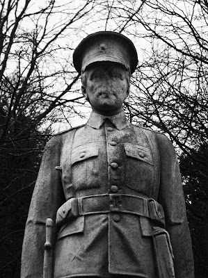
Taken from below makes it look larger and more powerful, emerging over the sky in the background, shows personal background on the person buried, eroded face shows lack of identitiy, death or ruins to the statue as the person.
Close up feels as if it is looking straight at you.
Longer shot showing the exact occupation of the person buried.
Angel looking to the sky, praying, religious composition shows a religious person buried. Flash used here, brings out the stone detail better but less darkness.
Same composition, no flash, works better with the eeriness of the photo.
Hand grasping a bird, no life, shows the cycle of water too, from freezing to ice.
Fairy, childlike, praying, again religious.
Cherub child in snow, winter effect works well, low angle creates more size to it, more emotion towards a child, statue almost presents the death.
Composition works well, focuses just on the statue, contrasts well with the sky, seems as if it is flying or supernatural, larger.
Close up, simple background.
Mid shot, shows religious part of the statue, more emotion shown on the face.
Show expression of sadness and loss, childlike and touching.
Longer shot, child is almost climbing for someone out of reach.
Close view of angels facing eachother.
View of angel/fairy facing eachother, quite contrasting towards the idea of presenting the dead.
I like this because it could seem like the sad statue is turned away and mourning death, but the flowers are fully alive, I used photoshop to keep the flowers in colour to emphasise this.


No comments:
Post a Comment