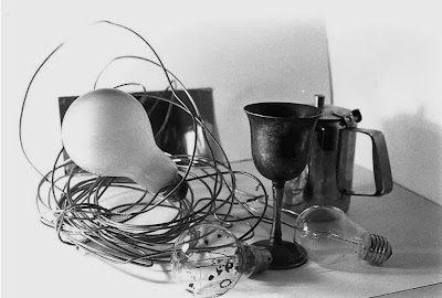
I then did a test strip of each of my photographs. For them all I had my contrast on 5 (the highest) with the filter on, and my light of 11 because it was on this number for my first test strip and worked well I decided to stick to it.
The timing worked best on 3 or 4 seconds (darker side being the part of the photograph exposed first so exposed the longest, each different shade adding on a second from light to dark) I decided to produce a print of exposure time 3 seconds and then 4 to see if the lighter or darker result worked better.

Above is the print exposed for 3 seconds, I like it and think that it turned out perfectly, the contrast darkens the metal cup and lightens the background making it look more effective and natural. The focus in this photograph was correct on the SLR and I didn't try anything fancy with it, every object appears clear and focused.
Above is my 4 second exposure print, it creates more of shadow from the light when it is darker, but I preferred the 3 second one because this one looked a bit too gloomy and over-exposed.
The test strip above worked best at an exposure of 3 seconds so below is the print created like this.
This photograph is possibly my favourite one of still life I have taken, instead of everything being in focus I focused on only the tap handle, it shows light reflecting and I am drawn straight to it because of the unclear and blurry background being blurred out of my attention effectively for the photograph. I can see a slight watermark on the right side of the print, I later noticed it on the negative as dried water rather than an error of my own.
This test strip worked ebst at an exposure of 3 seconds it seemed...
After I did this I thought it looked a bit too dark so looking back at my test strip and realising the part of the photograph exposed for 3 seconds was the lightest part, the wine bottle being darker looked over-exposed at this time though because of its darker shade, although 2 seconds was too light so below is my print of the same photograph exposed for 2.5 seconds.
Test strip above shows 3 seconds as the best exposure time.
I like this print particularly because of the shadows created and the clear reflections from the teapot, also the lighter parts of the objects glistening with light reflecting off them, also the slight appearance of the lamp itself in the left top corner.
For this photograph I didn't do a test strip because I felt that 3 seconds worked well for all the rest, although I think it is successful it is brighter than the other, showing a more natural light from the windows of the classroom coming through.
This above photograph turned out well although it is slightly pixelated because I decided to experiment with the photo in photoshop to see what I could do by altering the contrast and brightness on the screen as well as adding it on the enlarger. The shadows were brought out more and I liked the effect it created although I preferred the natural light looking look in my other photographs, exposure time was also 3 seconds.
The test strip above is blurred/jolted because of my accidental movement of it when moving the black paper along whilst it was gradually being exposed, although I can still tell that 3 seconds is again the best exposure time.
I played around with the focus ring again in this photograph, I focused on the lightbulb in the cup, although it reminded me more of a snow globe when photographed. The blurred background works effectively in contrast to the perfectly focused bulb because it is different and more interesting, I think particularly clear focus on on large part of a photograph works well with close up shots on single objects.
The above test strip works well at either 3 or 4 seconds it seems, so I tried out 3, 3.5 and 4 to see what shade of darkness and light works best.
3 second exposure (above) looks natural because of more window light coming through, I am pleased with the outcome of it.
3.5 is my favourite, resides between the lighter and darker outcome, and uses the contrast well because of this, also stays looking natural rather than edited.
4 seconds was slightly too dark, looks over exposed and not as effective and clear as the 3 or 3.5 seconds, no relections and looks as if a flash would need to be added, which we didn't use for these photographs.
Best exposure time for the test strip above was 2.5, 3 looked too dark and 2 too light.
This photograph was rather different to the others, instead of focusing on a particular close up object, I focused on the cup and taps in the background, leaving the wine bottle out of focus although it is much darker than the rest of the picture and we are drawn to it first, I preferred the close up focused photographs although this was something different for me to try out.
Here is tried to focus on something in a midshot rather than close up or too in the background, I think it works well in a simular way to the close up, the background is still clear because of the accurate 3 second exposure which I successfully guessed for this photograph rather than testing. The light difference on the different angles of the wall captured in the backgound works well too.
This photograph was taken using a digital SLR, focus slightly differed from the bulb and jar accidently, but I still liked it, I liked the colours of the paint splashes showing as actual colours rather than contrasting shades in the SLR photographs.
Another DSLR photograph, shows shadows well and bicycle wheel is quite a random object to put with the jar although the bulbs could relate to thinking and jar to creativity, shadows created work well.
Same DSLR photograph but this time edited on photoshop to black and white, and contrast and brightness adjusted to its most effective appearance.
Again edited on photoshop in the same way, I like the blacks contrasting with the whiter shades here.
Although the DSLR looks clearer and more modern, I think the naturally created light and contrast on the SLR photographs works better, the vintage style of the prints works well in relation to the old and maybe mis-used and abandoned objects. The black and white also works better because I like the shades created from the light.
*No photoshop or computer editing on these photographs unless stated*


No comments:
Post a Comment