Friday 15 February 2013

Film Photographs - Arter Inspired Photographs (Inner Character & Spaces).

First of all I needed to take darkroom photographs of the college campus (inspired by After taking photographs of his uni. campus), although the photographs are obviously modern day ones so they won't have the value of time involved but it would still be good to experiment to see what they could look like when these actual prints are photographed as they are held up to a wider shot of the same scenery.
Filter 5, f16, 20 seconds & 15 second burn on bottom half.
This shot was by the exit of college, the Coulsdon college name is visible to show this, I also captured a slight blur which I originally wanted so that I could create a sense of movement and distant presence. The use of natural lighting works well to create a shadow and contrast between straight line son the ground and a bristly rounder look on the trees.
FIlter 5, f16, 15 seconds.
I think that a ray of light may have interfered with the capturing got this image on the left side of the photograph, it gave a slight hexagonal bokeh look to it but the result was that it looks over exposed, I captured the exit of college by the doors, I feel that this shot was perhaps slightly too long/wide and instead I should have captured the doors close up and used this frame as the digital photograph I will produce from holding it. I like the silver tones on the floor they remind me of solarisation because of the contrast between whit sand grey/silver rather than black.
Filter 5, f16, 20 seconds & 10 second burn on bus area.
Here I represented the college journey, I included a London bus to show location and the different between somewhere like London compared to another country or up North. The movement of his walking is captured here. He is photographed in a way that he is unaware of it, just like the people in the old photographs Arter used were.


Thursday 14 February 2013

Film Photographs - Abandoned Place Photographs (Spaces).

I put myself into Rensbergen's shoes and visited an abandon place, this was a warehouse and was fairly large with various rooms and corridors, I felt scared being here and I didn't know if anyone was lurking about or if I was even safe.
Filter 5, f16, 14 seconds.
Here I captured the room I was in and a transition to another room outside of that room, I liked the way the light gradually appears, we see graffiti which shows that life has been in here before and the light works well to symbolise this, as we move closer to where I was standing the darkness takes over more, the corner I have captured creates a creepy feeling of tension and fear of the unknown. The shapes are very sharp and straight, triangles and squares of the wood and ruined architecture of the building fit together quite well but also remind me of abstraction.
Filter 5, f16, 8 seconds & 2.5 burn on the middle/bottom.
Here we can see things that are gradually falling down/breaking down, the dark tones show fear, lots of objects are involved and there are various things going on, the floor looks quite grainy, tires show circles and squares are also involved making the scene seen rather messy.
Filter 5, f16, 16 seconds.
This picture has more light captured on it, I found long shots of this location worked better because they did it justice on its size - they showed how big and how much exploring there was to do rather than zooming in on one aspect, the perspective works well here, distance is shown as we see it becoming further and further away.
Filter 5, f16, 15 seconds, slightly dogged on the top third.
Window frame shows reflection and involves light, shadowing on the walls looks blurred because of all the staining on them along with the graffiti showing the grimier and more dirty side to the place in this more closely framed shot.
Filter 5, f16, 12 seconds.
Slightly blurred, in focus but perhaps jolted a little bit, gives a ghostly and eerie effect to it, the right side is shadowed and makes us fear something is there, the reflection in the mirror makes us wonder if there is anything more or supernatural to see in this. Squares involved in this composition work geometrically.
Filter 5, f16, 15 seconds.
Line is very important here because of the beams on the ceiling and the falling ones which are all black contrasting the lighter tones on the ground along with the ruins, we can tell the place has been left alone for a fairly long time because of what we see in this photograph.
Filter 5, f16, 14 seconds.
This framing didn't work very well because I feel like the focus is split between the middle corridor leading to the light and the other one on the right hand side, also the piled up tired and darker objects around, this make it too busy and I would focus on just one of these situations if I were to do this again.

I feel that out of my 3 photo shoots on this film (this, Davidson & Arter) these photographs are my strong point. The idea of going inside somewhere dangerous and wanting to get outside had the best emotional value and also produced the best photographs in terms of tones, focus and subject matter. 

Film Photographs - Davidson Inspired Photographs (Inner Character).

For my four initial ideas on my film strip, I wanted to continue my Davidson inspired idea of a character with a masked identity, I wanted to see how film photographs rather than digital would enhance the appearance of them, how an older looking grainy surface would link more to his work (50's) than my flawless digital photographs.
F16, filter 5, 15 seconds plus 7.5 second burn on background.
The tones in the trees here match the dark solid black of his clothing, although they contain enough/silver/grey tones to let his figure stand out, the line and shape is important to the composition because it forms it, we can see the black lines symbolising tree branches and silver tones for the grass which helps us determine what is what. Following my shooting plan I made use of the scenery and experimented with different types of shot/distance.
F16, filter 5, 12 seconds plus 3 seconds burning top right corner.
The smell and sense of touch is evoked here through the cigarette, a sense of rebellion or power created within his glance, the white looks dirty and smudged, the grey tones show the smoke rising. The depth of field would be more effective win the negative space if there was more of it to emphasise my use of this technique.
F16, filter 5, 14 seconds, didging on left side.
The negative was slightly under developed on the left side of this photograph, technically this isn't good but it reminded me of something ghostly or supernatural, he could be looking at something because compositionally he happens to be facing the same way, shadowing here is very effective, we can see the dark tones created from where the is standing. During developing the actual print a piece of it had uneven development, because I will be taking this photograph further for experimentation so I will correct this using the appropriate timing to achieve a better result. I used a gun toy as a prop added on from the mask and cigarette I decided to use following my shooting plan, this gave it quite a gangstah and menacing look.theme.
F16, filter 5, 12 seconds.
Here the depth of field is more obvious, the trees fad into the background rather than taking over the picture, lines on his hat are visible and also on his collar where they are more visible and contrasted, the white is what we are drawn to first, the range of tones are various from white to solid black which works well compared to the greys of the hands, it almost acts as a high lighter to what we are meant to focus on (what is more bright/dark) - the face, black clothing and depth of the structure of the face created from the mask shape.
F16, filter 5, 12 seconds.
Here I attempted to capture the smoke more fictively and this worked, it created a sense of smell and cold to it because of the pale misty look it created. It also looks like the mask is fading away and it blend sin to the effective depth of field of the trees, I prefer the background of the previous side shot photograph because he looks more unnatural and relaxed, I find that this pose looks too planned and false because of the angle it has been taken from, it is more unusual to see someone from this angle so it didn't work as effectively.
F16, filter 5, 15 seconds plus 7.5 second burn on middle to right of photograph.
This was a zoomed in shot of him standing isolated, it avoids the scenery slightly here and instead focus son him, I like the way he is the centre of the frame and we are instantly drawn to his menacing and piercing glance which we are directly face to face with, the formal elements work well here because of how contrasted they are with his clothing, the bold black of the suit is what makes him so dark and creates the shape of his figure that we are drawn to.

As you can see I focused on framing the photographs in a similar way as I had done with my digital shots because the whole idea was to recreate this but on a more technical level in the darkroom. I am pleased with how my shots turned out because of the contrast I have been able to achieve in the darkroom, although for improvement, next time I shoot a roll of film I will be sure to examine it after developing to see if it is in need of extra fixing time so that I don't get slightly under exposed parts on the negatives themselves. I would also have liked to take more photographs of this subject, originally the 24 exposure film was meant to give me 8 exposures for each of my 3 starting ideas but I only got 6 because of accidentally exposing part of the film by opening the back of the camera.

Wednesday 13 February 2013

Film 1 Shooting Plan.

Here is my shooting plan, for my first film these are the 3 ideas I've gathered to shoot inspired by photographers work that I have liked the look of and feel that it could influence my themes within the exam theme - inner character and spaces. I have described what I plan to make use of for each of the shoots and how I plan to enhance some of them and recreate a personalised version/response to the work of artists that I have liked so far.

Tuesday 12 February 2013

Joshua Arter Analysis.

A senior graduate enrolled at Diederich College of Communication at Marquette University in Milwaukee, Wisconsin. This photograph is part of series displayed on his website (joshuaarter.weebly.com) in a selection named 'Dear Marquette', this particular photograph named 'O'Donnell Hall, East Entrance', his university which he quotes 'They say a picture is worth 1000 words, in Marquette's case its worth 130 years'. The work is photographs from years ago placed by hand and in the framing of a photograph taken more recently (2010) of the same place. Combines the original darkroom print with a DSLR photograph. The content goes deeper to symbolise a meaning and value of the place in the past, connecting then and now, the concept is simple yet powerful and shows us how change occurs over time in the historic campus of the university. The theme could be described as documentary, documenting the place now but combining and enhancing it by past photographs, it gives a sense of time and shows the place realistically in view, but almost like a portal into the past, when we look at the picture we know that it has been produced on a whole by someone standing there because of the visibility of the hand, we get a sense of actually being there and our sense of touch is evoked by the framing creating an illusion of us standing there in person in his shoes. The pictures are blurred in the background because he has deliberately used the focus to create a depth of filed and let us only see the past clearly, yet only blurred to a point where we can still tell exactly what it is and that it is the same place. I think that the meaning can be depicted quite easily when it is thought about because of the stereotypical style of photography 100 years ago (black and white, quite old fashioned clothing according to nowadays) and we see a link to the pas immediately, the personal history and exactly where these photographs have been taken isn't immediately obvious though. Action isn't taking place at the scene, he is there photographing by himself and we sense a silence, almost an echo of how the place used to be rather than how it is now, a sense that something has happened rather than happening.

The framing is quite casual, it doesn't look like it needs a tripod or anything to enhance the professional quality of it, the point is that it shows someone standing holding a photograph onto the same place, spacial awareness and dimensions are important to place it correctly. Contrast is seen between the black and white print in perfect focus and the blurred colour, the balance is quite odd but they sit well together because of the lines connecting the spaces together which make sit clear it is the same place. The arrangement is pleasing because of this and how the squares and the perspective of the photographs are the same and the geometric squares match up.

The photograph has obviously been planned because of the thought needed to gain access to these older photographs and knowing exactly where each one is placed, it has been posed and held correctly to achieve a successful effect composition. The camera use has been revolved around the focus ring, also taken advantage of a sunny days natural lighting, the darkroom has also used a slow and dull exposure to achieve the highest contrast between the black and white tones, digital imagery hasn't been enhanced by text or filters but maybe added contrast for a more professional and valuable effect. 

This work doesn't effect me personally in terms of emotion but I can see that somebody who has grown up in this area would be effected because of the past and personal link, I can imagine a similar effect on myself if I was to do this to an area that I am familiar with. The artists feeling when doing this were probably quite nostalgic, he probably thought of the past in his own life on the campus. I like the piece because of the research and thought that has been put into producing such an emotional series.


Henk van Rensbergen Analysis.

Henk van Rensbergen, born in 1968, got his first camera at 16 and first started photographing at the age of 20, his occupation is a professional pilot which could link to his photography because of his travelling which allows him to see various scenery and new locations allover the world and holiday destinations where he would fly to. His website - abandoned-places.com doesn't make it too clear at first who he is, the page has a gallery section which is present don what looks like a complicated compass that he calls a photo wheel on the links back to this to navigate various photoshoots he has done (again symbolising places/direction). The website name also indicates his personal interests, all of the photography on this website is his own personal experiences when visiting derelict places. I think that the work fits a theme of spaces (relating to my second starting point), it shows the inside of places that have been left, they could also be considered partly outside because of how wrecked and ruined they are which I could also link to a ruined emotion relating to inner character - my first starting point. The subject matter of this particular photograph shows doors which could hide what is inside as we can only see the outside, the bathroom/tiled scene is rather dirty and the man silhouette on the floor reminds us of life and shows that it is empty in this place and gives us the impression people shouldn't be here, also the pieces title 'Dead Body' which invokes the die oaf the drawing on the floor. The content goes deeper, Rensbergen addresses life issue when he explains that when visiting this place he bump dint an elderly lady who was having to live there, she addressed to him that she had seen more frightening characters than him around which makes you think about what she has seen and reminds us of a scary situation or supernatural film. The photograph hasn't been blurred/enhanced, it is digital (DSLR) and is perfectly in focus, perhaps contrast has been added to bring out the colours (yellows of the wall, darkened dirt in places). The meaning I see is personal interest, all of his photographs are of abandon deplanes clearly because the enjoys the experience and recording his findings, the far tit is a part time bobbie too shows dedication to the subject. No action is taking place but we get the sense that it has because it would have originally have been built for a reason, perhaps leisure purposes.
The photograph looks like it has been framed using a fish eye lens to get the whole room to fit in the frame, the lines bending on the walls support this. Shape is used, the squares of the door frames themselves are quite abstract, they are meant to be straight and accurately lined up but instead they have been altered by the angle of the fish eye lens. They connect with the smaller squares going in the same direction on the walls and also the squares on the floor which go in a diagonal direction. Rhythms have been created by this, they all fit together as if they are broken pieces which could metaphorically mean fitting them back together all broken because of the abandoned atmosphere. The arrangement in my opinion could have worked better as a landscape framing which wouldn't leave it looking as clamped in and squashed, although this could takeaway some of the meaning which could be crushing or destroying of the place that once was in use. 

I don't think much planning has gone into the photograph because Rensbergen didn't know what to expect or see in this location because the exploring meant it was new to him, although he must have thought about using a fish eye lens. The technical use of camera is obviously this wide angled lens, in terms of editing and manipulation it has been kept the same and not much alteration has been done at all.

The work effects me because I have visited abandoned places in the past and could relate to his story telling of fear when going there, the task to climb in and hope that you're not seen, it also evoked my interest to return and for me to visit more place alike this for photographic purposes. Isolation could be a good word to describe this work, we get the sense no one was with him or around him, this could also influence my work emotionally and possibly involve the figure in future photoshoots.

Bruce Davidson Analysis.

'Dwarf', 1958, by Bruce Davidson, part of a series of 6 photographs showing a dwarf who plays a slow in a 'Circus' which is a photographic book by Davidson of 88 pages containing 131 titrone plates including this photograph on one of them. Davidson is American and was born in 1933, he is a member of Magnum Photos group where they believe 'photography is a community of thought, a curiosity for what is going on in the world'. I think that this photograph relates to a documentary theme, the dwarf is seen in a regular place and this photograph isn't clearly set up as a photo shoot but instead a realistic moment is captured by Davidson who is invisible to the scene (no eye contact to his camera lens), it gives a sense of what happens to the dwarf on a regular and this is Davidson documenting this. The content of subject matter goes quite deep, it shows a the dwarf as lonely, by himself and clearly being laughed at my an intimidating group, his saddened expression shows how he is feeling and the emotional inner character, it addresses life issue such as bullying and morals - how people can be treated horribly because of a mental or in this case physical disability. The subject matter is realistic, although it could be interpreted as exaggerated because of how clear the group are making it that they are making fun of him, but it is still possible. The meaning is immediately obvious because of the contrast between his sadness and the groups amusement. The flowers in the photograph could be symbolic to the dwarfs sadness because they are dying and drooping. The action taking place creates a sense of movement in the photograph, we sense that anything could happen in terms of the dwarf being made fun of or leaving.

The piece has been framed from a point of view of someone standing near the dwarf, the low angle shows the person looking down at the dwarf which symbolises the sadness and how he is seen as smaller than everyone else. The man laughing is in focus and the couple are out of focus. This shows a clear view that the dwarf can see him laughing but could be unaware of the couple but still expecting it. The objects such as the tables and the distance the people are from the camera are kept quite random, not much thought has gone into it because it captures a realistic scene and meaning to it. Formal elements used are tone to present what is in focus as fairly desaturated and what we see first (the dwarf and then the laughing man) as more contrasted in black and white to grey tones. The subject matter is more important than the shape and line of the photograph because of the narrative and symbolic meaning to it. The overall arrangement of the picture works well because it puts us in the position of actually standing next to the dwarf and witnessing his sadness over being bullied, it makes us think about what we would do if in the situation of being there which is what documenting pictures is all about.

I think the photograph has been planned in a sense of the dwarf being involved in another photograph by Davidson but the situation of the people laughing could have been planned for the subject matter to the photograph or judging by other photographs of the dwarf in this series, this situation could have actually occurred, the fact my secondary researched tells us he is a clown also pokes fun and is a slight pun to him being laughed at. The camera has used a depth of field dot blur on the people in the background but used blurring to keep the dwarf and other man in focus. The darkroom hasn't enhanced this image but has given it highest possible contrast.

The piece effects my mood negatively because it is a harsh subject matter and upsetting to see somebody this upset over peoples ignorance. The pieces shows harsh reality and this is one of the reasons I chose to analyse it, also the idea of putting how people feel into perspective, the dwarfs inner character comes out and so does the people laughing, our emotions of sympathy are evoked so this relates to my chosen starting points because of that and because of how the space is used and given a depth of field.

Spaces Digital Photographs.

Last minute I was told about Klaus Pichler's photographs of fruit rotting, this evoked me to photograph some fruit myself, apples and grapes were all that I had and because I needed them to rot, they wouldn't be ready to photograph for at least a week so I decided to photograph them every day to see the cycle of them gradually rotting. With the starting point of spaces, I thought that I could link this by explaining that it is the space around the fruit which rots it (which is what these photographs represent) rather than taking photographs of actual spaces.
I lay them out cut up so that they would mould/brown quicker, I lay them out in a compositionally good way so that I could see all of them and they didn't look too randomly placed. I photographed them from above (to view the whole of the fruit and the inside of it) and found that medium long shots were best for this, they didn't look as effective in colour as they did black and white, if I could do these photographs again I would give myself more time so that I can let them rot a great deal more, I would also consider a black back drop and taking the photographs in colour so that I could relate it more to Pichler's work.
Day 1
Day 2
Day 3
Day 4
Day 5
Day 6
I liked the visible change in these photographs but I don't think I would take this idea any further because of my own lack of personal interest in the subject matter, and how long it took because of the waiting in-between in photograph, I thought that I could perhaps experiment on how to enhance them, for example the visible texture could become quite interesting if I peeled the skin off of off apples and collaged them onto these photographs to involve colour in the photographs and a more layered up and interesting look.
Quite simple, lay slices on top of the photograph, created quite abstract shapes contrasting triangular pieces with circles of the apples the original picture was slightly too hidden even though this helped create a layered effect.
I cleared the amount of apples slightly to reveal more of the original photograph, this worked well and also having more of the red tones from the apple to mix with the yellow and peach to create a mixing of colours that are still in the same spectrum and don't contrast each other too much, this wouldn't work because of the contrast already there from the colour and the black and white.
Here the transparency of one of the slices looks like it is gradually blending into the grey tones of the actual photograph. The fresh apples carry the healthy colour and the rotten photograph symbolically sits in the dark.
Here I had a similar slice of apple to the large apple in the photograph peering in to give a clearer contrast, it didn't work as well without the red tones of the peelings.
Abstract triangular shapes again, build up layers and create a look of randomly dropping them down after dropping which shows the practical approach in the photographs.
The peelings have quite high transparency here, the reds are deep and the grey and black also look quite dark because of the lack of contrast from the apples being so rotten.
Flash from the photography made this slightly unsuccessful because of the look of over exposure around the middle, over than that the layering of the peelings worked well for tone and colour.
Kept the peelings at the bottom in the negative space of the original photograph to fill them in, the result here looked quite packed but I felt that that was the best way of taking these photographs.
I liked the practical process of producing these experimentations but it didn't evoke any more ideas in terms of taking my subject matter further, I felt that it was quite limited in this sort of method of photographing and using these as a subject matter because of lack of variation in my framing, although I felt shots from further away may not work as well because they would involve more of the background rather than the apples themselves, taking away the original meaning. So far I have enjoyed photographing the figure more in my Davidson inspired shoot, therefore I feel more determined to carry out that idea.

Starting Point Two - Spaces.

I have selected 'Spaces' as my second starting point because I thought that because of the location of my first photo shoot for 'Inner Character' I could link my second photo shoot for spaces to this by using even more random locations, my main inspiration was Bruce Davidson's 'Dwarf' photographs, the spacial location was clearly shown in these photographs and i feel that I could emphasise it more with this theme but also still involve the human figure.

Primary sources I plan to use for research are an abandoned warehouse in Thornton Heath, also using secondary research to find out more about its background story to see if this could be created in my experimentations. I also want to use objects relating to it which I could use in my photographs. Secondary resources also include the websites and work of the artists I plan to look at.

Artists work that I will be looking at are Joe Collier (who has visited many abandoned places and photographed the ruins) because I like the mystery behind the pictures and feel that I could incorporate human figures into them, even though the subject matter is completely opposing I can create an idea of them being disturbed and invasive. Work by Yves Marchand and Romain Meffre (who showcase their work on a joint website) explore abandoned places that have a more modern and entertainment side to them such as theatres rather than asylums, photographer David Williams has many series of photographs and one that caught my eye are his Post Office photographs which involve people in the scenery which could link with what I want to do with the mysterious looking places. Also, Henk Van Rensbergen who describes abandoned places as well as using his photographs to present visual evidence to his emotions while visiting. I also like the idea of what spaces do to subject matter, e.g Klaus Pichler's fruit photographs.

I would like to experiment with primary sources such as leaves and objects relating to abandon deplanes and incorporate them in my experiments. I would also like to try using liquid emulsion to create my prints on something other than photographic paper. Also I would like to try a cyanotype to see if it would give my photographs an eerie look to them with the detail being unclear.

I think that ripping and burning will be good hand experiments to do on these photographs because it represents the actual ruin of the place. I could also sew in historic reports/letters/paper articles relating to the place itself to give it a more informative effect. In the darkroom I could create a photograph on top of my photograph using objects that relate to the place, e.g medical tools for an asylum. I would also like to digitally enhance them by creating a light beam to contrast the dark side of the place itself, also try some double exposures of different scenes of the place involving a person to give them a ghostly appearance.
(Top row left to right, second row left to right, bottom top left to right)

Friday 8 February 2013

Inner Character Digital Photographs.

To start myself off and trigger ideas, I decided to stage a shoot inspired by Davidson's photographs of the dwarf, one which appealed to me the most was where this face was masked and he was standing alone. I tried to convey this interest in the scenery and appearance of where the was standing in this first photograph. I used a digital camera for these so that I could quickly capture various shots and then decide whether to use film or not once I know whether to take this theme/idea further. Black and white was chosen to give the photographs an older look to them.
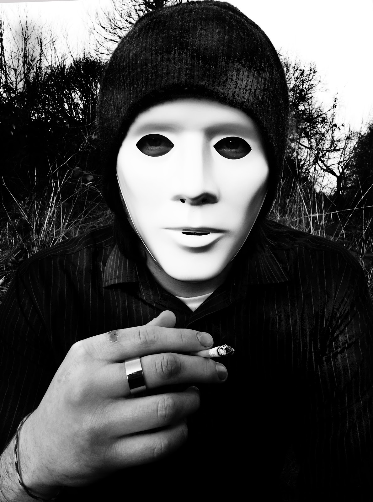
The setting was rather abandoned and the trees looked messy which worked well for looking like somewhere he shouldn't be. The masked face hid the identity and the cigarette created a powerful look, quite menacing when combined with the face. The framing as a long shot was inspired by the way Davidson took his photograph but I chose to do mine landscape to capture the scenery more.
 I had to use a range of shots because it would be too time consuming to keep changing location like Davidson did and this was only my starter. I liked this photograph because we see his stare looking straight at us, it is more portraiture than documentary, I liked the contrast created from the clothing compared to the background which had lighter blacks.
 A side on shot, wasn't too keen on this because the framing was slightly out of place, the right arm could have been completely in the photograph, the trees worked well and created a spooky look though.
This photograph gives a slightly look to his appearance but still keeps it hidden, his thoughtful expression links with the starting point and shows his inner emotions. The shadow and detail on the hand was created on photoshop by burning the skin lines to darken them, so was the depth of the shadowing on the mask and hat, I like the tones of grey and black in this because of how dark and light they go, it almost looks slightly solarised.

Here I started experimenting with these photos by hand, because of the black and white harsh contrast in the photograph I thought that I could link this with the mysterious subject matter by eerily dripping black ink down the photograph to represent something strange and spooky appearing into the picture.
This was slightly over bearing and took away the attention being drawn to the face and the cigarette by making the mask less noticable.
I tried to use the ink on the smoke here to give an abstract illusion of black smoke which worked quite well, by letting it drip it made it look like it was flowing free.
I tried the dripping effect again here but kept it more limited so that it was so thick and over bearing, it worked much better because of the liquid only thinly dripping down the face and leaving it visible and clear to what it it still, they also matched the stripes on his clothing giving a zoomed in effect.
Here I created the smoke with just dots rather than drips which contrasted the stripes, it gave it a child like effect which was creepy when involved with a serious subject matter. 
I then decided to scan the photographs onto graph paper and newspaper to see how they would look then. This one above reminded me of a radar system because of the lines over the photograph which gave me the idea that this photograph could be represented more deeply by the man being a criminal and being tracked.
Here the newsprint gave an idea again that he is somebody mysterious who is being looked for and being seen by the public as unidentified.
Here the lines were more close up and reminded me of a cage meaning he could be trapped, I think the lines on the graph paper show through enough to be noticed and work well because they aren't too overbearing.
Here I combined the two experiments I have already done by printing the results I had from dripping ink of the photographs onto the same types of paper. This looked rather random because of the graph lines and ink dripping being so different, I think that the effects work best by themselves because they are sharp and simple like the photographs themselves.
I felt the same about this photograph, especially because I didn't originally like the result of the ink on it.
This photograph ended up cropped after being printed on because of the printer ink smudging and ruining the effect, I didn't try to correct this because I felt that the effects combined didn't work well anyway.
Surprisingly my last try was my favourite, the dots over took the lines leaving them in the background which was good but also meant that they weren't really needed at all with this effect.
With the newspaper the effect worked better, it looked like information in the paper trying to be destroyed, the slight peach tone of the background balanced the different between normal paper and newsprint well.
Here the green paper sat just of the face unintentionally but worked well, it looked as if he was being scanned for and spotted.

My favourite effect out of these was the photographs of newsprint because of the simple and sophisticated link they had with the idea of identity being concealed and unknown, with my further photographs in the project I will return to this for other subject matter where relevant.